A visualization tool made in Pygame for various pathfinding algorithms.

Overview

forthebadge made-with-python

Pathfinding-Visualizer 🚀

A visualization tool made in Pygame for various pathfinding algorithms.

Pathfinding is closely related to the shortest path problem, within graph theory, which examines how to identify the path that best meets some criteria (shortest, cheapest, fastest, etc) between two points in a large network.

Pathfinding Algorithms in the Visualizer :

  • BFS (Breadth First Search)
  • Dijkstra's algorithm
  • A* Search algorithm

Features:

  • User can specify the start node 🟥 , end node 🟪 and barrier nodes ⬛ .
  • To run:
 BFS       : Press the 'b' key
Dijkstra : Press the 'd' key
A* Search : Press the 'a' Key
Reset : Press the 'c' Key
Reset the visualization part: Press the space bar
  • User can reset the whole board or they can just clear out the visualization part .
  • More information on the features and 'How to use' are given in the tutorial window of the app.
  • If the program failed to find a path between start and end node:
    (for eg: start or end node covered with barriers leaving no open cell to move.)
    Then the user will get a popup window informing that it couldn't find a path.

Demo

  • Tutorial window:

  • Nodes marked by the user:

  • A* Search algorithm visualization:

  • Dijkstra algorithm visualization:

  • BFS visualization:

You might also like...
Interactive Data Visualization in the browser, from  Python
Interactive Data Visualization in the browser, from Python

Bokeh is an interactive visualization library for modern web browsers. It provides elegant, concise construction of versatile graphics, and affords hi

Statistical data visualization using matplotlib

seaborn: statistical data visualization Seaborn is a Python visualization library based on matplotlib. It provides a high-level interface for drawing

Fast data visualization and GUI tools for scientific / engineering applications

PyQtGraph A pure-Python graphics library for PyQt5/PyQt6/PySide2/PySide6 Copyright 2020 Luke Campagnola, University of North Carolina at Chapel Hill h

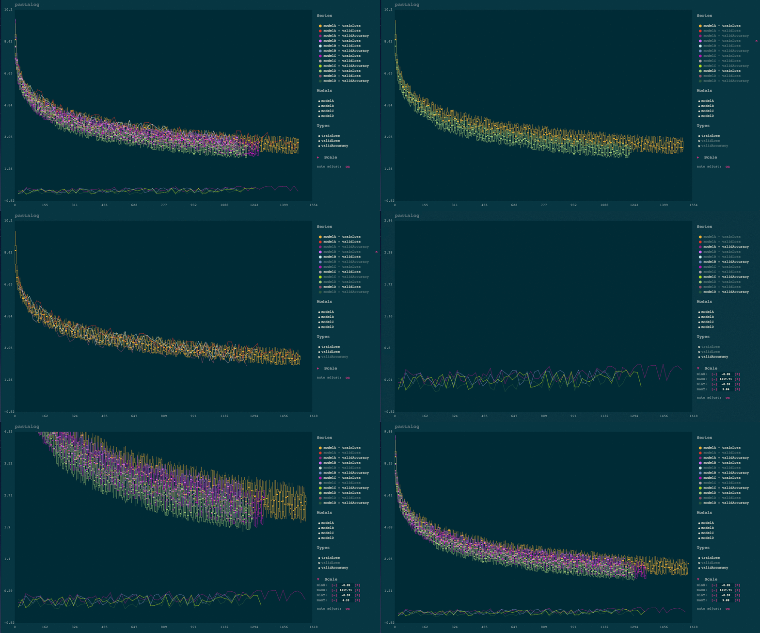
Simple, realtime visualization of neural network training performance.

pastalog Simple, realtime visualization server for training neural networks. Use with Lasagne, Keras, Tensorflow, Torch, Theano, and basically everyth

Apache Superset is a Data Visualization and Data Exploration Platform

Superset A modern, enterprise-ready business intelligence web application. Why Superset? | Supported Databases | Installation and Configuration | Rele

Debugging, monitoring and visualization for Python Machine Learning and Data Science

Welcome to TensorWatch TensorWatch is a debugging and visualization tool designed for data science, deep learning and reinforcement learning from Micr

Statistical data visualization using matplotlib

seaborn: statistical data visualization Seaborn is a Python visualization library based on matplotlib. It provides a high-level interface for drawing

Interactive Data Visualization in the browser, from  Python
Interactive Data Visualization in the browser, from Python

Bokeh is an interactive visualization library for modern web browsers. It provides elegant, concise construction of versatile graphics, and affords hi

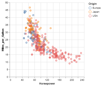
Declarative statistical visualization library for Python

Altair http://altair-viz.github.io Altair is a declarative statistical visualization library for Python. With Altair, you can spend more time understa

Comments
  • How to add grid movement cost

    How to add grid movement cost

    Thank you for your work, it is very useful to me. I have a need and need your help: add the moving cost of the square. At present, the default step length of the white square is 1, and the black square is set as an obstacle. How to add a square with a step length of 2, 5, 10 or other values (the path can pass through this square, but the number of steps used is not the default value 1). For example, add a gray square with a step of 5? The advantage of this is that it can highlight the difference between the Dijkstar algorithm and the BFS algorithm. Looking forward to hearing from you.

    opened by dingjia123 5
  • Picture problems of start, end and grass

    Picture problems of start, end and grass

    Thanks for your work, I want to replace the corresponding squares of start, end and grass on the map with pictures instead of filling like red, purple or green. The goal is that the effect will look more realistic. But I'm new to pygame, trying to modify the code but can't achieve what I want. can you help me? Is it possible to provide an example such as modifying the picture of start. Looking forward to hearing from you. @Sana-078

    opened by Shame-fight 12
Owner
Aysha sana
Aysha sana
This is a super simple visualization toolbox (script) for transformer attention visualization ✌

Trans_attention_vis This is a super simple visualization toolbox (script) for transformer attention visualization ✌ 1. How to prepare your attention m

Mingyu Wang 3 Jul 9, 2022
A gui application to visualize various sorting algorithms using pure python.

Sorting Algorithm Visualizer A gui application to visualize various sorting algorithms using pure python. Language : Python 3 Libraries required Tkint

Rajarshi Banerjee 19 Nov 30, 2022
Pebble is a stat's visualization tool, this will provide a skeleton to develop a monitoring tool.

Pebble is a stat's visualization tool, this will provide a skeleton to develop a monitoring tool.

Aravind Kumar G 2 Nov 17, 2021
SummVis is an interactive visualization tool for text summarization.

SummVis is an interactive visualization tool for analyzing abstractive summarization model outputs and datasets.

Robustness Gym 246 Dec 8, 2022
Squidpy is a tool for the analysis and visualization of spatial molecular data.

Squidpy is a tool for the analysis and visualization of spatial molecular data. It builds on top of scanpy and anndata, from which it inherits modularity and scalability. It provides analysis tools that leverages the spatial coordinates of the data, as well as tissue images if available.

Theis Lab 251 Dec 19, 2022
Simple spectra visualization tool for astronomers

SpecViewer A simple visualization tool for astronomers. Dependencies Python >= 3.7.4 PyQt5 >= 5.15.4 pyqtgraph == 0.10.0 numpy >= 1.19.4 How to use py

null 5 Oct 7, 2021
D-Analyst : High Performance Visualization Tool

D-Analyst : High Performance Visualization Tool D-Analyst is a high performance data visualization built with python and based on OpenGL. It allows to

null 4 Apr 14, 2022
Regress.me is an easy to use data visualization tool powered by Dash/Plotly.

Regress.me Regress.me is an easy to use data visualization tool powered by Dash/Plotly. Regress.me.-.Google.Chrome.2022-05-10.15-58-59.mp4 Get Started

Amar 14 Aug 14, 2022
This is a Boids Simulation, written in Python with Pygame.

PyNBoids A Python Boids Simulation This is a Boids simulation, written in Python3, with Pygame2 and NumPy. To use: Save the pynboids_sp.py file (and n

Nik 17 Dec 18, 2022
Declarative statistical visualization library for Python

Altair http://altair-viz.github.io Altair is a declarative statistical visualization library for Python. With Altair, you can spend more time understa

Altair 8k Jan 5, 2023