A tool for creating SVG timelines from simple JSON input.

Overview

Timeline

A tool for creating SVG timelines from JSON.

Example

You will be able to create timelines that look like this:

simple timeline example

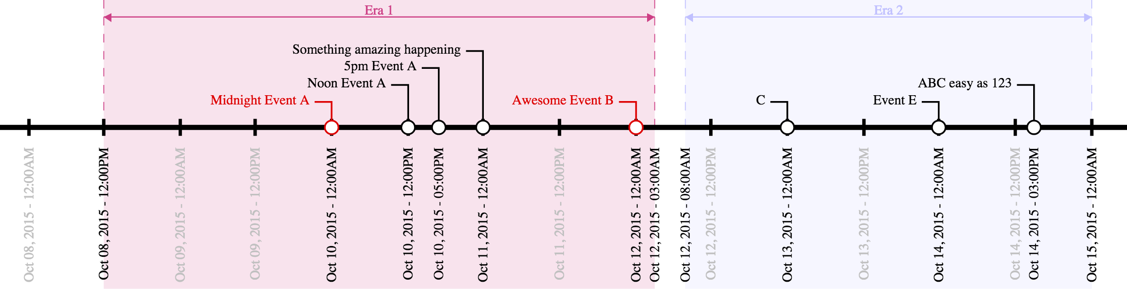
from JSON that looks like this:

{
	"width" : 750,
	"start" : "Oct 8 2015",
	"end" : "Oct 15 2015",	
	"num_ticks" : 14,
	"tick_format" : "%b %d, %Y - %I:%M%p",
	"callouts" : [
		["ABC easy as 123", "Oct 14, 2015 3pm"],		
		["Midnight Event A", "12am Oct 10, 2015", "#DD0000"],
		["Noon Event A", "12pm Oct 10, 2015"],		
		["5pm Event A", "5pm Oct 10, 2015"],				
		["Something amazing happening", "Oct 11, 2015"],
		["Awesome Event B", "Oct 12, 2015", "#DD0000"],
		["C", "Oct 13, 2015"],
		["Event E", "Oct 14, 2015"]
	],
	"eras" : [
		["Era 1", "12pm Oct 8, 2015", "3am Oct 12, 2015", "#CD3F85"],
		["Era 2", "8am Oct 12, 2015", "12am Oct 15, 2015", "#C0C0FF"]
	]
}

Data Format

The input file is a JSON document that describes the start and end points of the timeline, tickmarks along the main axis, as well as callouts to specifc dates/times, and eras which visually mark areas along the axis. Many of the fields are dates, which can be described in several common date formats (e.g., "3/14/15", "Nov 11, 2011", etc.) and may optionally also include a time of day (e.g. "3/14/15 9:26am"). (Date/time parsing is handled by the Python package parsedatetime, which parses many formats.)

Required Fields

The only required fields are width, start, and end. All other fields are optional.

  • width describes the width, in pixels, of the output SVG document. The height will be determined automatically.
  • start is the date/time of the leftmost date/time on the axis.
  • end is the date/time of the rightmost date/time on the axis.

Optional Fields

  • num_ticks contols the number of tickmarks along the axis between the start and end date/times (inclusive). If this field is not present, no tickmarks will be generated except for those at the start and end dates.
  • tick_format describes the string format of the tickmarks along the axis. It follows the Python datetime formatting conventions.

Callouts

Callouts along the axis are described in the callouts list. Each entry in the callouts list is itself a list with either two or three values, all of which are strings. The first two values are required, while the third is optional. The first value is the text description of the callout (e.g., "Pi Day"), and the second value is the date/time of the callout (e.g., "3/14/15 9:26am"). The optional third value can specify a color for the callout, either a color hexcode starting with a # or a SVG color alias.

Example:

["Ultimate Pi Day", "3/14/15 9:26am"]

or, with a custom callout color:

["Ultimate Pi Day", "3/14/15 9:26am", "#CD3F85"]

Eras

Eras are described in the eras list. Like the callout list, each entry in the eras list is itself a list with either three or four values. The first three are required while the fourth is option; all values are strings. The first value is a text description of the era (e.g., "Summer"), while the second and third values are the start and end date/times of the era, respectively (e.g., "6/21/15 12am", and "9/20/15 11:59pm"). The optional fourth value can specify a color for the era, either a color hexcode starting with a # or a SVG color alias.

Example:

["Summer 2015", "6/21/15 12am", "9/20/15 11:59pm"]

or, with a custom era color:

["Summer 2015", "6/21/15 12am", "9/20/15 11:59pm", "Orange"]

Prerequisites

You must have a python 2.7 installation and install the Python packages parsedatetime and svgwrite.

Usage

./make_timeline.py in.json > out.svg

You might also like...
erdantic is a simple tool for drawing entity relationship diagrams (ERDs) for Python data model classes

erdantic is a simple tool for drawing entity relationship diagrams (ERDs) for Python data model classes. Diagrams are rendered using the venerable Graphviz library.

Yata is a fast, simple and easy Data Visulaization tool, running on python dash

Yata is a fast, simple and easy Data Visulaization tool, running on python dash. The main goal of Yata is to provide a easy way for persons with little programming knowledge to visualize their data easily.

A simple python tool for explore your object detection dataset

A simple tool for explore your object detection dataset. The goal of this library is to provide simple and intuitive visualizations from your dataset and automatically find the best parameters for generating a specific grid of anchors that can fit you data characteristics

Simple spectra visualization tool for astronomers

SpecViewer A simple visualization tool for astronomers. Dependencies Python = 3.7.4 PyQt5 = 5.15.4 pyqtgraph == 0.10.0 numpy = 1.19.4 How to use py

simple tool to paint axis x and y

simple tool to paint axis x and y

Simple plotting for Python. Python wrapper for D3xter - render charts in the browser with simple Python syntax.

PyDexter Simple plotting for Python. Python wrapper for D3xter - render charts in the browser with simple Python syntax. Setup $ pip install PyDexter

The open-source tool for building high-quality datasets and computer vision models

The open-source tool for building high-quality datasets and computer vision models. Website • Docs • Try it Now • Tutorials • Examples • Blog • Commun

The open-source tool for building high-quality datasets and computer vision models

The open-source tool for building high-quality datasets and computer vision models. Website • Docs • Try it Now • Tutorials • Examples • Blog • Commun

SummVis is an interactive visualization tool for text summarization.

SummVis is an interactive visualization tool for analyzing abstractive summarization model outputs and datasets.

Comments
  • Port to Python 3

    Port to Python 3

    Thanks for this great project! It wouldn't work at first due to requiring Python 2, so I made a quick port to Python 3 that seems to work so far (sample JSON file renders correctly). If there are any other tests I should run just let me know!

    opened by dohliam 1
  • Feature Request & Porting to py3

    Feature Request & Porting to py3

    This is a very handy script to have around. Does a good job of simply generating json data to timeline svg images.

    Desperately needs to be officially ported to python3. At least two out of the five pull requests are available to accomplish this.

    If I can find the time, a few extra features could be added to make working with this script much easier.

    • dynamically determined sizes based on defined width.
    • incorporation of argparse.
    • etc, etc...
    opened by anoduck 0
  • Rotate x labels

    Rotate x labels

    I think rotated x labels would make the timeline easier to read. It is usually suggested to have them at rotated 40 degrees instead of 90 degrees. Or make the rotation angle an option?

    My 2 cents

    PS: Thanks for sharing your work in this repo!

    opened by espinielli 0
Owner
Jason Reisman
Jason Reisman
GitHubPoster - Make everything a GitHub svg poster

GitHubPoster Make everything a GitHub svg poster 支持 Strava 开心词场 扇贝 Nintendo Switch GPX 多邻国 Issue

yihong 1.3k Jan 2, 2023
Generate SVG (dark/light) images visualizing (private/public) GitHub repo statistics for profile/website.

Generate daily updated visualizations of GitHub user and repository statistics from the GitHub API using GitHub Actions for any combination of private and public repositories, whether owned or contributed to - no server required.

Adam Ross 2 Dec 16, 2022
A tool for creating Toontown-style nametags in Panda3D

Toontown-Nametag Toontown-Nametag is a tool for creating Toontown Online/Toontown Rewritten-style nametags in Panda3D. It contains a function, createN

BoggoTV 2 Dec 23, 2021
A simple interpreted language for creating basic mathematical graphs.

graphr Introduction graphr is a small language written to create basic mathematical graphs. It is an interpreted language written in python and essent

null 2 Dec 26, 2021
A script written in Python that generate output custom color (HEX or RGB input to x1b hexadecimal)

ColorShell ─ 1.5 Planned for v2: setup.sh for setup alias This script converts HEX and RGB code to x1b x1b is code for colorize outputs, works on ou

Riley 4 Oct 31, 2021
Draw tree diagrams from indented text input

Draw tree diagrams This repository contains two very different scripts to produce hierarchical tree diagrams like this one: $ ./classtree.py collectio

Luciano Ramalho 8 Dec 14, 2022
Handout for the tutorial "Creating publication-quality figures with matplotlib"

Handout for the tutorial "Creating publication-quality figures with matplotlib"

JB Mouret 1.9k Jan 2, 2023
A python wrapper for creating and viewing effects for Matt Parker's christmas tree.

Christmas Tree Visualizer A python wrapper for creating and viewing effects for Matt Parker's christmas tree. Displays py or csv effect files and allo

null 4 Nov 22, 2022
A Python Binder that merge 2 files with any extension by creating a new python file and compiling it to exe which runs both payloads.

Update ! ANONFILE MIGHT NOT WORK ! About A Python Binder that merge 2 files with any extension by creating a new python file and compiling it to exe w

Vesper 15 Oct 12, 2022
Pebble is a stat's visualization tool, this will provide a skeleton to develop a monitoring tool.

Pebble is a stat's visualization tool, this will provide a skeleton to develop a monitoring tool.

Aravind Kumar G 2 Nov 17, 2021