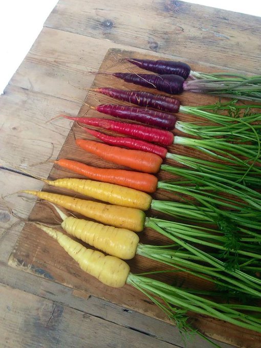
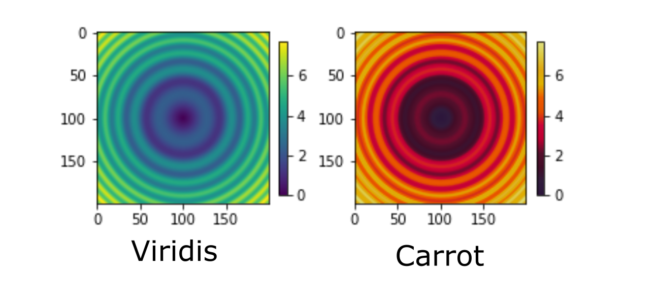
Because nowadays python graphics libraries are working with perceptually uniform colormaps
(matplotlib viridis, plasma, inferno, magma, all cmocean colormaps, and more) I analysed your carrots colormap with ehtplot,
https://github.com/liamedeiros/ehtplot, a tool developed by scientists involved in the EHT (Event Horizon Telescope) project. This Python module was developed before the publication of the first black-hole image.
ehtplot asseses a colormap and if it isn't perceptually uniform in the color space CAM02-UCS, it can uniformize it.
More precisely, there is a function that converts the r, g, b color-coordinates of a colormap to lightness, chroma and hue, as coordinates in the CAM02-UCS space. and then plots the three corddinates vs the normalized data values.
A colormap is perceptually uniform in this space if the lightness is a linear function of these values.
In the first image posted below, the upper cell illustrates the representation of the carrots colormap lightness in this space.

The lightness graph is colored by the colormap. Unfortunately it is nonlinear, and moreover the three heatmaps that ususlly can reveal other drawbacks of the colormap, illustrate in the first heatmap the effect of lightness nonlinearity (distinct color bands). The second and the third heatmap reveal that we cannot distinguish dark colors in the displayed squares. The low values of normalized data are represented by almost the same dark color.
I uniformized your colormap, with lightness between 20 and 95, and the second pannel illustrates how uniform_carrots colormap looks like.
 Here https://github.com/empet/Datasets/blob/master/unif_carrots.txt is the array or (r, g, b)-color codes, representing the
 uniform_carrots colormap.


 Here
Here 