Data
Trump's Tweeted Words

Meteor Data
 This plot modeled meteorite mass's in given years. I thought the increase was neat.
This plot modeled meteorite mass's in given years. I thought the increase was neat. Bokeh is an interactive visualization library for modern web browsers. It provides elegant, concise construction of versatile graphics, and affords hi
Altair http://altair-viz.github.io Altair is a declarative statistical visualization library for Python. With Altair, you can spend more time understa
missingno Messy datasets? Missing values? missingno provides a small toolset of flexible and easy-to-use missing data visualizations and utilities tha
Bokeh is an interactive visualization library for modern web browsers. It provides elegant, concise construction of versatile graphics, and affords hi
Altair http://altair-viz.github.io Altair is a declarative statistical visualization library for Python. With Altair, you can spend more time understa
missingno Messy datasets? Missing values? missingno provides a small toolset of flexible and easy-to-use missing data visualizations and utilities tha
The HyperNetX library provides classes and methods for the analysis and visualization of complex network data. HyperNetX uses data structures designed to represent set systems containing nested data and/or multi-way relationships. The library generalizes traditional graph metrics to hypergraphs.
physt P(i/y)thon h(i/y)stograms. Inspired (and based on) numpy.histogram, but designed for humans(TM) on steroids(TM). The goal is to unify different
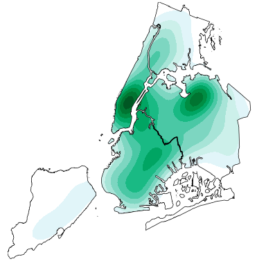
geoplot: geospatial data visualization geoplot is a high-level Python geospatial plotting library. It's an extension to cartopy and matplotlib which m
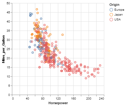
seaborn: statistical data visualization Seaborn is a Python visualization library based on matplotlib. It provides a high-level interface for drawing
seaborn: statistical data visualization Seaborn is a Python visualization library based on matplotlib. It provides a high-level interface for drawing
seaborn: statistical data visualization Seaborn is a Python visualization library based on matplotlib. It provides a high-level interface for drawing
Data visualization using matplotlib project instructions Top 5 Most Common Coffee Origins In this visualization I used data from Ankur Chavda on Kaggl
Dashboard For The DexConnect Platform of Dexterity Global Working prototype submission for internship at Dexterity Global Group. Dashboard for real ti
Visualization Website by using Dash and Heroku You can visit the website https://payroll-expense-analysis.herokuapp.com/ In this project, I am interes
Altair http://altair-viz.github.io Altair is a declarative statistical visualization library for Python. With Altair, you can spend more time understa
Bokeh is an interactive visualization library for modern web browsers. It provides elegant, concise construction of versatile graphics, and affords hi
Welcome to TensorWatch TensorWatch is a debugging and visualization tool designed for data science, deep learning and reinforcement learning from Micr
sorting_algo_visualizer Python script to generate a visualization of various sorting algorithms, image or video.
 14.7k Feb 13, 2021
 6.4k Feb 13, 2021
 3.4k Dec 29, 2022

 304 Dec 27, 2022
![Python histogram library - histograms as updateable, fully semantic objects with visualization tools. [P]ython [HYST]ograms.](https://github.com/janpipek/physt/raw/dev/doc/heights.png)
 120 Dec 8, 2022

 10.2k Dec 30, 2022
 13 Oct 27, 2021
 2 Jun 15, 2021
 1 Jan 14, 2022
 8k Jan 5, 2023
 17.1k Dec 31, 2022
 3.3k Dec 27, 2022
 146 Nov 12, 2022