Calendar heatmaps from Pandas time series data

Overview
Note: See MarvinT/calmap for the maintained version of the project. That is also the version that gets published to PyPI and it has received several fixes to issues.

Calendar heatmaps from Pandas time series data

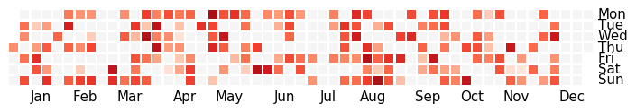
Plot Pandas time series data sampled by day in a heatmap per calendar year, similar to GitHub's contributions plot, using matplotlib.

Example calendar heatmap

Usage

See the documentation.

Installation

To install the latest release via PyPI using pip:

pip install calmap
Comments
  • How to add a colorbar legend next to a calmap.calendarplot?

    How to add a colorbar legend next to a calmap.calendarplot?

    Hi,

    I'm currently heavily relying on your module to plot calendar heatmap. Your module is great but I wonder If you know a simple way to put a colorbar for the whole figure on the left of the calendar heatmap figure. It could also be a neat feature in your next iteration on the module to have an option to put automatically the colorbar when creating the heatmap.

    opened by BreitA 15
  • Deprecation warnings with Matplotlib 2.0.x

    Deprecation warnings with Matplotlib 2.0.x

    When run with Matplotlib 2.0.2 (Python 3.6.2) I get the following deprecation warnings:

    /.../venv/lib/python3.6/site-packages/calmap/__init__.py:128: FutureWarning: how in .resample() is deprecated
    the new syntax is .resample(...).sum()
      by_day = data.resample('D', how=how)
    /.../venv/lib/python3.6/site-packages/calmap/__init__.py:146: MatplotlibDeprecationWarning: The get_axis_bgcolor function was deprecated in version 2.0. Use get_facecolor instead.
      linecolor = ax.get_axis_bgcolor()
    

    Just a heads up for future proofing.

    opened by janik6n 10
  • AttributeError: 'DataFrame' object has no attribute 'ix'

    AttributeError: 'DataFrame' object has no attribute 'ix'

    In version 1.0.0 of Pandas, Series.ix and DataFrame.ix was removed, breaking calmap. See https://pandas.pydata.org/docs/whatsnew/v1.0.0.html

    However, this method is still used at https://github.com/martijnvermaat/calmap/blob/83e2a9a0bdc773c9e48e05772fb412ac8deb8bae/calmap/init.py#L220

    opened by sibbl 9
  • resolve deprecated problem of pandas

    resolve deprecated problem of pandas

    I got the following warning and make this patch.
    /usr/local/lib/python2.7/site-packages/calmap/init.py:295: FutureWarning: how in .resample() is deprecated the new syntax is .resample(...).sum()

    by_day = data.resample('D', how=how)

    data.resample('D', how=how) is deprecated and use data.resample('D').sum() instead.

    opened by lyltj2010 7
  • Border between two continuous months & day numbers in cells

    Border between two continuous months & day numbers in cells

    Thanks for a useful calendar heatmap package. Is it easy to add the two above features? For the 1st one, an example is black lines in [https://bl.ocks.org/mbostock/4063318]

    opened by nhanitvn 4
  • Bug with the 'sum' aggregation.

    Bug with the 'sum' aggregation.

    When I run the code on the doc page: import numpy as np; np.random.seed(sum(map(ord, 'calmap'))) import pandas as pd import calmap

    all_days = pd.date_range('1/15/2014', periods=700, freq='D') days = np.random.choice(all_days, 500) events = pd.Series(np.random.randn(len(days)), index=days) calmap.yearplot(events, year=2015) I get the following result: screenshot1 Only when I change the aggregation to be mean, I get the expected result:

    calmap.yearplot(events, year=2015,how=u'mean') screenshot from 2019-02-03 22-36-33

    python version: 3.7.1 pandas version: 0.23.4 calmap version: 0.0.7 matplotlib version: 3.0.1

    opened by yygrechka 3
  • Color of year labels separate

    Color of year labels separate

    If fillcolor is specified, it's also used as the color for the yearlabels. This can be very impractical if you want days with no data to be shown in white. Then the yearlabels vanish.

    opened by Thomasillo 3
  • Adds a month separator feature (#14)

    Adds a month separator feature (#14)

    To draw the lines, I had to modify some part of the code:

    1. Added a "month" column to the dataframe.
    2. If the first days of the year are part of last year's week (would be week 52), offset every week by 1 so they are now week 1, the previous week 1 is now week 2, etc. This is so that we know where to draw the lines.
    3. I have added a small padding to the axes (0.3 of one cell) in order to avoid the outside lines being cut by the axes limit.
    4. The month ticks position has been slightly pushed to the left so that their center now lines up with the center of the average week number.

    This PR will break the tests because the output images are going to be different. This is not due to the month separator per se but to the slight esthetic changes (more margin and tick labels more centered). Would need to regenerate the baseline images.

    opened by ma-schmidt 3
  • Added month separator feature (#14) and fix the pandas warning (#10)

    Added month separator feature (#14) and fix the pandas warning (#10)

    For the fix, the two issues that were raised in the previous PR were:

    1. The how argument to these functions is now ignored. Using the agg aggregation generic function, we can pass the how parameter.
    2. It breaks compatibility with previous versions. Checking the version before and conditioning on having at least 0.18.0 solves this.

    For the month separator, my solution was to draw a bunch of lines with a bit of logic to figure out how to deal with the first day of the month. I also slightly modified were the month labels were placed because they didn't line up very well.

    opened by ma-schmidt 3
  •  'fillcolor' in calmap.calendarplot doesn't work right

    'fillcolor' in calmap.calendarplot doesn't work right

    when i use calmap.calendarplot without 'fillcolor', this is the result image and when i use calmap.calendarplot with 'fillcolor', this is the result, it adds the label of year image

    opened by Starrry22 2
  • Axes.get_axis_bgcolor() is deprecated, replaced with the new call.

    Axes.get_axis_bgcolor() is deprecated, replaced with the new call.

    Axes.get_axis_bgcolor() is deprecated, replaced with the new call.

    https://matplotlib.org/api/_as_gen/matplotlib.axes.Axes.get_axis_bgcolor.html https://matplotlib.org/api/_as_gen/matplotlib.axes.Axes.get_facecolor.html

    opened by michaelnugent 2
  • Font is causing trouble in Linux cronjobs

    Font is causing trouble in Linux cronjobs

    If I use your calmap function on my Linux Red Hat Enterprise distribution, I'll get the warning findfont: Font family ['Arial'] not found. Falling back to DejaVu Sans. Normally the warning will be just ignored, but if executed in the context of a cronjob it will cause the job to exit. In your code the Font is defined in Line 308:

    ylabel_kws = dict(
            fontsize=32,
            color=kwargs.get('fillcolor', 'whitesmoke'),
            fontweight='bold',
            fontname='Arial',
            ha='center')
    

    Could this be changed to fontfamily = 'serif' or to a parameter?

    Since I don't have admin rights on this machine there is no way for me to just install the missing Font.

    opened by bonedi 0
Sprint planner considering JIRA issues and google calendar meetings schedule.

Sprint planner Sprint planner is a Python script for planning your Jira tasks based on your calendar availability. Installation Use the package manage

Apptension 2 Dec 5, 2021
Python ts2vg package provides high-performance algorithm implementations to build visibility graphs from time series data.

ts2vg: Time series to visibility graphs The Python ts2vg package provides high-performance algorithm implementations to build visibility graphs from t

Carlos Bergillos 26 Dec 17, 2022
Time series visualizer is a flexible extension that provides filling world map by country from real data.

Time-series-visualizer Time series visualizer is a flexible extension that provides filling world map by country from csv or json file. You can know d

Long Ng 3 Jul 9, 2021
NumPy and Pandas interface to Big Data

Blaze translates a subset of modified NumPy and Pandas-like syntax to databases and other computing systems. Blaze allows Python users a familiar inte

Blaze 3.1k Jan 1, 2023
Visualize your pandas data with one-line code

PandasEcharts 简介 基于pandas和pyecharts的可视化工具 安装 pip 安装 $ pip install pandasecharts 源码安装 $ git clone https://github.com/gamersover/pandasecharts $ cd pand

陈华杰 2 Apr 13, 2022
Using SQLite within Python to create database and analyze Starcraft 2 units data (Pandas also used)

SQLite python Starcraft 2 English This project shows the usage of SQLite with python. To create, modify and communicate with the SQLite database from

null 1 Dec 30, 2021
The Spectral Diagram (SD) is a new tool for the comparison of time series in the frequency domain

The Spectral Diagram (SD) is a new tool for the comparison of time series in the frequency domain. The SD provides a novel way to display the coherence function, power, amplitude, phase, and skill score of discrete frequencies of two time series. Each SD summarises these quantities in a single plot for multiple targeted frequencies.

Mabel 3 Oct 10, 2022
Sparkling Pandas

SparklingPandas SparklingPandas aims to make it easy to use the distributed computing power of PySpark to scale your data analysis with Pandas. Sparkl

null 366 Oct 27, 2022
Create HTML profiling reports from pandas DataFrame objects

Pandas Profiling Documentation | Slack | Stack Overflow Generates profile reports from a pandas DataFrame. The pandas df.describe() function is great

null 10k Jan 1, 2023
Productivity Tools for Plotly + Pandas

Cufflinks This library binds the power of plotly with the flexibility of pandas for easy plotting. This library is available on https://github.com/san

Jorge Santos 2.7k Dec 30, 2022
A high-level plotting API for pandas, dask, xarray, and networkx built on HoloViews

hvPlot A high-level plotting API for the PyData ecosystem built on HoloViews. Build Status Coverage Latest dev release Latest release Docs What is it?

HoloViz 697 Jan 6, 2023
A GUI for Pandas DataFrames

PandasGUI A GUI for analyzing Pandas DataFrames. Demo Installation Install latest release from PyPi: pip install pandasgui Install directly from Githu

Adam 2.8k Jan 3, 2023
Bokeh Plotting Backend for Pandas and GeoPandas

Pandas-Bokeh provides a Bokeh plotting backend for Pandas, GeoPandas and Pyspark DataFrames, similar to the already existing Visualization feature of

Patrik Hlobil 822 Jan 7, 2023
Joyplots in Python with matplotlib & pandas :chart_with_upwards_trend:

JoyPy JoyPy is a one-function Python package based on matplotlib + pandas with a single purpose: drawing joyplots (a.k.a. ridgeline plots). The code f

Leonardo Taccari 462 Jan 2, 2023
Interactive plotting for Pandas using Vega-Lite

pdvega: Vega-Lite plotting for Pandas Dataframes pdvega is a library that allows you to quickly create interactive Vega-Lite plots from Pandas datafra

Altair 342 Oct 26, 2022
Create HTML profiling reports from pandas DataFrame objects

Pandas Profiling Documentation | Slack | Stack Overflow Generates profile reports from a pandas DataFrame. The pandas df.describe() function is great

null 6.8k Feb 18, 2021
Productivity Tools for Plotly + Pandas

Cufflinks This library binds the power of plotly with the flexibility of pandas for easy plotting. This library is available on https://github.com/san

Jorge Santos 2.1k Feb 18, 2021
A high-level plotting API for pandas, dask, xarray, and networkx built on HoloViews

hvPlot A high-level plotting API for the PyData ecosystem built on HoloViews. Build Status Coverage Latest dev release Latest release Docs What is it?

HoloViz 349 Feb 15, 2021
A GUI for Pandas DataFrames

PandasGUI A GUI for analyzing Pandas DataFrames. Demo Installation Install latest release from PyPi: pip install pandasgui Install directly from Githu

Adam 2k Feb 17, 2021