The Spectral Diagram (SD) is a new tool for the comparison of time series in the frequency domain

Overview

Spectral-Diagram (SD)

This repo refers to this article:

Calim et al., 2021: The Spectral Diagram as a new tool for model assessment in the frequency domain: Application to a global ocean general circulation model with tides, Computers and Geosciences, 2021,104977,ISSN 0098-3004,

CAGEO ScienceDirect

The Spectral Diagram (SD) is a new tool for the comparison of time series in the frequency domain. The SD provides a novel way to display the coherence function, power, amplitude, phase, and skill score of discrete frequencies of two time series. Each SD summarises these quantities in a single plot for multiple targeted frequencies.

Although the SD has been designed for tidal analysis, it is a powerful tool for detecting co-oscillating patterns in multi-scale analyses, and this approach might provide guidance in devising skill scores for inter-comparing model results.

Amplitude features in SDs: ScreenShot

Phase features in SDs: ScreenShot

The following is a summary of appropriate and inappropriate uses of SDs:

  • Careful interpretation is required when a non-stationary time series is subjected to SD analysis. In such cases, localized transforms, e.g., wavelets, are preferable.
  • Ensures that the Nyquist frequency is not violated before using SD diagram. Such a violation can result in poor approximation of the chosen frequency (or band of frequencies) via SD analysis if the time series is too short or the sampling rate is not small enough.
  • The SD enables a multiple band of frequencies analysis without using filtering techniques, which implies convolution costs.
  • It is possible to track different time slots and multi-region comparisons using a normalized standard deviation of power strategy, with the drawback that time series amplitude have to be scaled
  • It is a powerful tool to detect co-oscillating patterns in a multi scale analysis and anomalous patterns in a phenomena analysis.
  • SDs clearly display changes in amplitude and phase, thereby highlighting the co-oscillating frequencies to overcome the limited information contained in power spectrum analyses.
  • The need for better representing the degree of correspondence between simulated and observed fields for a given frequency (or frequency bands) is fulfilled by this novel tool inspired by relevant tide features.

Manual installation

First steps:

cd  PATH_TO_SAVE_SD_IN_YOUR_HOME
git clone https://github.com/mabelcalim/Spectral-Diagram.git
cd Spectral-Diagram/

A local install can be done using the provided setup.py file:

    python3 setup.py install

Pypi download
    python3 -m pip install SpecDiag==0.1.0

Support Group

users support group

Funding

This work was supported by National Counsel of Technological and Scientific Development (CNPQ), Grants No. 2012/02675-21, Coordination for the Improvement of Higher Education Personnel (CAPES) Grant No. 99999.005769/2014-00 (Migrado - BEX) (Doutorado-Sanduiche Australia), Bolsa Projeto CAPES/ANA BESM Grant No. 88887.115872/2015-01, and the National Institute for Science and Technology for Climate Change – INCT-MC Grant No. 465501/2014-1.

You might also like...
Pebble is a stat's visualization tool, this will provide a skeleton to develop a monitoring tool.

Pebble is a stat's visualization tool, this will provide a skeleton to develop a monitoring tool.

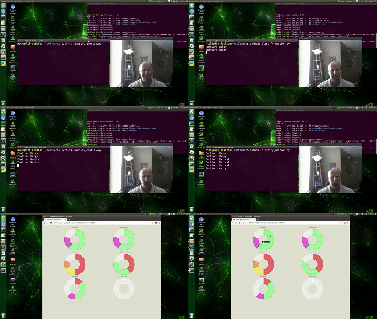
BrowZen correlates your emotional states with the web sites you visit to give you actionable insights about how you spend your time browsing the web.

BrowZen BrowZen correlates your emotional states with the web sites you visit to give you actionable insights about how you spend your time browsing t

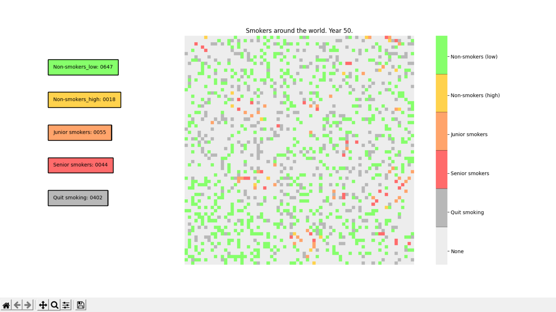
Smoking Simulation is an app to simulate the spreading of smokers and non-smokers, their interactions and population during certain amount of time.

Smoking Simulation is an app to simulate the spreading of smokers and non-smokers, their interactions and population during certain

A minimalistic wrapper around PyOpenGL to save development time

glpy glpy is pyOpenGl wrapper which lets you work with pyOpenGl easily.It is not meant to be a replacement for pyOpenGl but runs on top of pyOpenGl to

Visualise Ansible execution time across playbooks, tasks, and hosts.

ansible-trace Visualise where time is spent in your Ansible playbooks: what tasks, and what hosts, so you can find where to optimise and decrease play

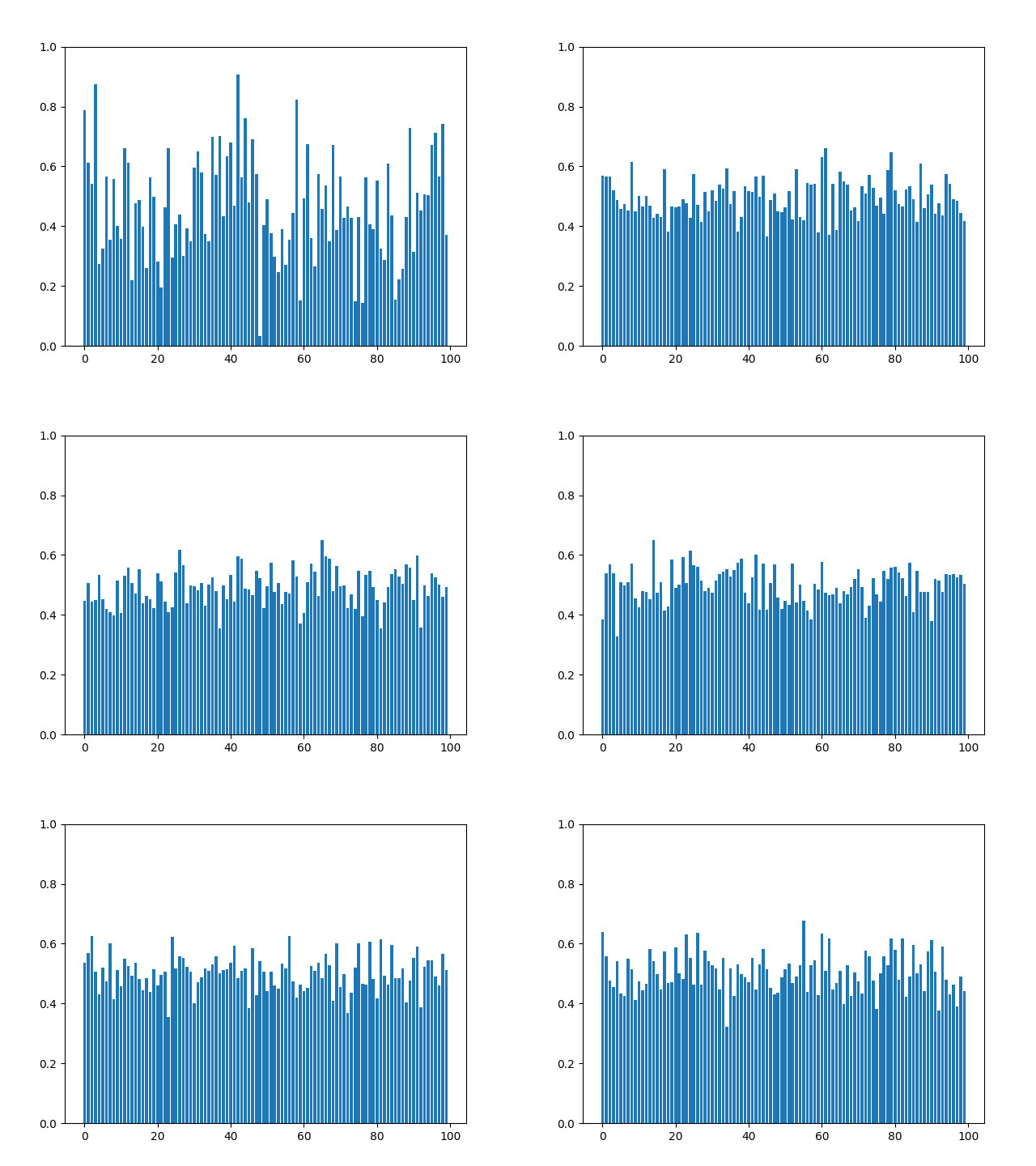
This plugin plots the time you spent on a tag as a histogram.

This plugin plots the time you spent on a tag as a histogram.

Arras.io Highest Scores Over Time Bar Chart Race

Arras.io Highest Scores Over Time Bar Chart Race This repo contains a python script (make_racing_bar_chart.py) that can generate a csv file which can

LabGraph is a a Python-first framework used to build sophisticated research systems with real-time streaming, graph API, and parallelism.

LabGraph is a a Python-first framework used to build sophisticated research systems with real-time streaming, graph API, and parallelism.

Movies-chart - A CLI app gets the top 250 movies of all time from imdb.com and the top 100 movies from rottentomatoes.com

movies-chart This CLI app gets the top 250 movies of all time from imdb.com and

Comments
  • installation error

    installation error

    Hi Thanks in advance for providing us with this new tool. I faced problem while trying to install SpecDiag manually .git clone command completed perfectly but when I apply for command

    python setup.py install

    error: package directory 'SpecDiag' does not exist is appeared. is there a folder missing from source code or shall we create an empty one manually.

    opened by AminFazlKazemi 1
Owner
Mabel
Mabel
Minimalistic tool to visualize how the routes to a given target domain change over time, feat. Python 3.10 & mermaid.js

Minimalistic tool to visualize how the routes to a given target domain change over time, feat. Python 3.10 & mermaid.js

Péter Ferenc Gyarmati 1 Jan 17, 2022
Python ts2vg package provides high-performance algorithm implementations to build visibility graphs from time series data.

ts2vg: Time series to visibility graphs The Python ts2vg package provides high-performance algorithm implementations to build visibility graphs from t

Carlos Bergillos 26 Dec 17, 2022
Time series visualizer is a flexible extension that provides filling world map by country from real data.

Time-series-visualizer Time series visualizer is a flexible extension that provides filling world map by country from csv or json file. You can know d

Long Ng 3 Jul 9, 2021
Calendar heatmaps from Pandas time series data

Note: See MarvinT/calmap for the maintained version of the project. That is also the version that gets published to PyPI and it has received several f

Martijn Vermaat 195 Dec 22, 2022
Friday Night Funkin - converts a chart from 4/4 time to 6/8 time, or from regular to swing tempo.

Chart to swing converter As seen in https://twitter.com/i_winxd/status/1462220493558366214 A program written in python that converts a chart from 4/4

null 5 Dec 23, 2022
Project coded in Python using Pandas to look at changes in chase% for batters facing a pitcher first time through the order vs. thrid time

Project coded in Python using Pandas to look at changes in chase% for batters facing a pitcher first time through the order vs. thrid time

Jason Kraynak 1 Jan 7, 2022
DataVisualization - The evolution of my arduino and python journey. New level of competence achieved

DataVisualization - The evolution of my arduino and python journey. New level of competence achieved

null 1 Jan 3, 2022
Active Transport Analytics Model (ATAM) is a new strategic transport modelling and data visualization framework for Active Transport as well as emerging micro-mobility modes

{ATAM} Active Transport Analytics Model Active Transport Analytics Model (“ATAM”) is a new strategic transport modelling and data visualization framew

Peter Stephan 0 Jan 12, 2022
A Python Binder that merge 2 files with any extension by creating a new python file and compiling it to exe which runs both payloads.

Update ! ANONFILE MIGHT NOT WORK ! About A Python Binder that merge 2 files with any extension by creating a new python file and compiling it to exe w

Vesper 15 Oct 12, 2022
Domain Connectivity Analysis Tools to analyze aggregate connectivity patterns across a set of domains during security investigations

DomainCAT (Domain Connectivity Analysis Tool) Domain Connectivity Analysis Tool is used to analyze aggregate connectivity patterns across a set of dom

DomainTools 34 Dec 9, 2022