Visualization ideas for data science

Overview

Nuance

I use Nuance to curate varied visualization thoughts during my data scientist career.
It is not yet a package but a list of small ideas. Welcome to test them out!

Why Nuance?

nuance n.
a subtle difference in meaning or opinion or attitude

How to use?

Please check instructions in the corresponding folder

List of ideas

  1. simple tree: visualize a sklearn Decision Tree

  2. sankey tree: visualize a sklearn Decision Tree

  3. sankey flow: visualize a sankey flow

  4. feature drift: visualize feature drift

       
You might also like...
Interactive Data Visualization in the browser, from  Python
Interactive Data Visualization in the browser, from Python

Bokeh is an interactive visualization library for modern web browsers. It provides elegant, concise construction of versatile graphics, and affords hi

Fast data visualization and GUI tools for scientific / engineering applications

PyQtGraph A pure-Python graphics library for PyQt5/PyQt6/PySide2/PySide6 Copyright 2020 Luke Campagnola, University of North Carolina at Chapel Hill h

Missing data visualization module for Python.

missingno Messy datasets? Missing values? missingno provides a small toolset of flexible and easy-to-use missing data visualizations and utilities tha

Statistical data visualization using matplotlib

seaborn: statistical data visualization Seaborn is a Python visualization library based on matplotlib. It provides a high-level interface for drawing

Interactive Data Visualization in the browser, from  Python
Interactive Data Visualization in the browser, from Python

Bokeh is an interactive visualization library for modern web browsers. It provides elegant, concise construction of versatile graphics, and affords hi

Fast data visualization and GUI tools for scientific / engineering applications

PyQtGraph A pure-Python graphics library for PyQt5/PyQt6/PySide2/PySide6 Copyright 2020 Luke Campagnola, University of North Carolina at Chapel Hill h

Missing data visualization module for Python.

missingno Messy datasets? Missing values? missingno provides a small toolset of flexible and easy-to-use missing data visualizations and utilities tha

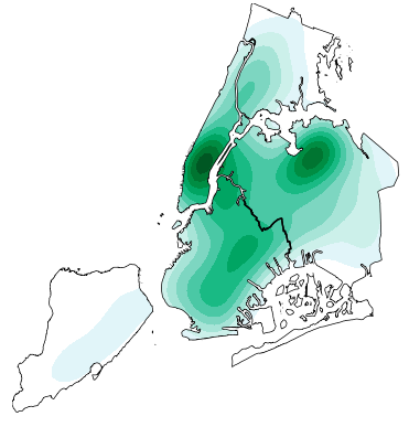
High-level geospatial data visualization library for Python.

geoplot: geospatial data visualization geoplot is a high-level Python geospatial plotting library. It's an extension to cartopy and matplotlib which m

Data Visualization Guide for Presentations, Reports, and Dashboards

This is a highly practical and example-based guide on visually representing data in reports and dashboards.

Comments
  • TypeError: only integer scalar arrays can be converted to a scalar index

    TypeError: only integer scalar arrays can be converted to a scalar index

    @SauceCat Hi I was trying out your tree generation code. I copied same lines of code from your example file but i am facing this issue(above mentioned). Please see the below notebook image I have attached. capture

    opened by IamAVB 1
  • feedback/different bugs

    feedback/different bugs

    Hi This looks amazing, however, I can't get it to run without more changes to the code. I just wanted to try this out, but issues keep coming up. I just wanted to let you know, so perhaps you or someone else can fix this.

    BTW, it'd be nice to have this packaged on pypi. If I can give you a hand, let me know.

    I found out that Nuance's default colormap doesn't exist (in my matplotlib distribution). So you have to set a different colormap, for example, 'viridis'.

    I had the same issues as the person before (other issues) with the tree n_classes being a numpy array, not a scalar, but this can be worked around if you set for example, target_colors=['green', 'red'].

    The next issues is this here:

    /content/Nuance/tree/src/generate_tree.py in _extract_rules(node_id, parent, pos, tree_rules, tree_info)
        165                 thre = tree_model.tree_.threshold[parent]
        166                 if feat not in previous.keys():
    --> 167                         tree_rules[node_id]['features'][feat] = [-sys.maxint, sys.maxint]
        168                 if pos == "left":
        169                         origin = tree_rules[node_id]['features'][feat][1]
    
    AttributeError: module 'sys' has no attribute 'maxint'
    

    I am happy to give this another go with more time. Just wanted to leave a feedback.

    Cheers.

    opened by benman1 1
Owner
Li Jiangchun
If I don't create, I don't understand.
Li Jiangchun
This is a super simple visualization toolbox (script) for transformer attention visualization ✌

Trans_attention_vis This is a super simple visualization toolbox (script) for transformer attention visualization ✌ 1. How to prepare your attention m

Mingyu Wang 3 Jul 9, 2022
Apache Superset is a Data Visualization and Data Exploration Platform

Superset A modern, enterprise-ready business intelligence web application. Why Superset? | Supported Databases | Installation and Configuration | Rele

The Apache Software Foundation 50k Jan 6, 2023
Apache Superset is a Data Visualization and Data Exploration Platform

Apache Superset is a Data Visualization and Data Exploration Platform

The Apache Software Foundation 49.9k Jan 2, 2023
Automatic data visualization in atom with the nteract data-explorer

Data Explorer Interactively explore your data directly in atom with hydrogen! The nteract data-explorer provides automatic data visualization, so you

Ben Russert 65 Dec 1, 2022
Data-FX is an addon for Blender (2.9) that allows for the visualization of data with different charts

Data-FX Data-FX is an addon for Blender (2.9) that allows for the visualization of data with different charts Currently, there are only 2 chart option

Landon Ferguson 20 Nov 21, 2022
These data visualizations were created for my introductory computer science course using Python

Homework 2: Matplotlib and Data Visualization Overview These data visualizations were created for my introductory computer science course using Python

Sophia Huang 12 Oct 20, 2022
Interactive Data Visualization in the browser, from Python

Bokeh is an interactive visualization library for modern web browsers. It provides elegant, concise construction of versatile graphics, and affords hi

Bokeh 17.1k Dec 31, 2022
Statistical data visualization using matplotlib

seaborn: statistical data visualization Seaborn is a Python visualization library based on matplotlib. It provides a high-level interface for drawing

Michael Waskom 10.2k Dec 30, 2022
Fast data visualization and GUI tools for scientific / engineering applications

PyQtGraph A pure-Python graphics library for PyQt5/PyQt6/PySide2/PySide6 Copyright 2020 Luke Campagnola, University of North Carolina at Chapel Hill h

pyqtgraph 3.1k Jan 8, 2023
Statistical data visualization using matplotlib

seaborn: statistical data visualization Seaborn is a Python visualization library based on matplotlib. It provides a high-level interface for drawing

Michael Waskom 8.1k Feb 13, 2021