Frbmclust - Clusterize FRB profiles using hierarchical clustering, plot corresponding parameters distributions

Overview

frbmclust

Getting Started

Clusterize FRB profiles using hierarchical clustering, plot corresponding parameters distributions. Input files (waterfall data, CHIME catalog) are stored in the resources/ directory, output files are stored in the plots/ directory.

Data used in the clustering belongs to the CHIME/FRB collaboration, CHIME/FRB Catalog 1 Paper.

Prerequisites

  • Python 3.7+

  • The vos Python module for downloading waterfall data: CANFAR storage system

    • pip install vos --upgrade --user
  • Python code related to DM calculations, estimations, and analysis: FRB

    • For FRB dependencies see: Installing FRB

      git clone https://github.com/FRBs/FRB.git
      cd FRB ; python setup.py install --user ; cd ..
      
      git clone https://github.com/FRBs/ne2001.git
      cd ne2001 ; python setup.py install --user ; cd ..
      
  • astropy v4.3+

    pip install --upgrade pip 
    pip install astropy
    
  • Installation/upgrade of side packages, which might be required for the version compatibility

    • pip install --user --upgrade lxml pandas ipython scipy matplotlib seaborn h5py
  • cosmocalc

    We download cosmocalc v0.1.2 and refactor it to be able to run under Python 3 (2to3 software is used and should be installed via package manager):

    curl https://files.pythonhosted.org/packages/ca/61/df95b65cd3cf3abdffcbeea6c77a6d8964a8fb625a88eccd9c73d2bfdbf0/cosmocalc-0.1.2.tar.gz | tar -x
    cd cosmocalc-0.1.2 ; 2to3 -w cosmocalc.py ; python setup.py install --user ; cd ..
    

Configuration

For the fast reproduction of the main results one can run python frb_profiles_clustering.py --use-preprocessed --use-precalculated-z.

Instead of preprocessed signal data, waterfall data can also be used, which is located in CANFAR storage and which can be downloaded with the -d flag. For the data to be used, it shoud be in the resources/ folder and have a following name: {frb_name}_waterfall.h5

To obtain preprocessed signals, run python repack_waterfall.py. It would download waterfall data from CANFAR storage one at a time and save only calibrated profiles – mean of calibrated waterfall data over each frequency channel.

When calling python frb_profiles_clustering.py several flags are available:

  • -d, --download: download waterfall data from CANFAR storage
  • -ef, --emission_freq: set emission frequency (MHz) used in brightness temperature calculations. Default value is 600 MHz
  • --use-preprocessed: use preprocessed signal profiles
  • --use-precalculated-z: use precalculated red-shift values
  • --use-latex: enable LaTeX support for plots
You might also like...
Getting started with Python, Dash and Plot.ly for the Data Dashboards team

data_dashboards Getting started with Python, Dash and Plot.ly for the Data Dashboards team Getting started MacOS users: # Install the pyenv version ma

Info for The Great DataTas plot-a-thon

The Great DataTas plot-a-thon Datatas is organising a Data Visualisation competition: The Great DataTas plot-a-thon We will be using Tidy Tuesday data

It's an application to calculate I from v and r. It can also plot a graph between V vs I.

Ohm-s-Law-Visualizer It's an application to calculate I from v and r using Ohm's Law. It can also plot a graph between V vs I. Story I'm doing my Unde

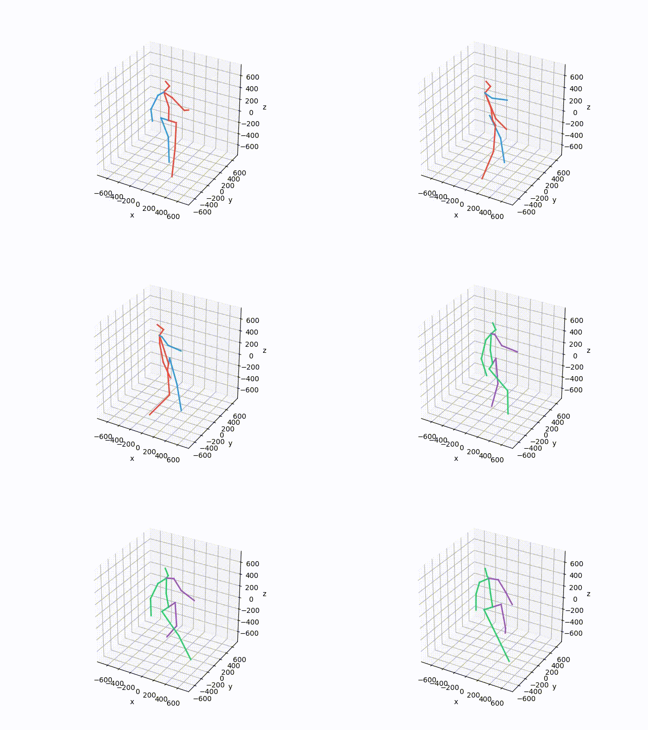
Plot and save the ground truth  and predicted results of human 3.6 M and CMU mocap dataset.
Plot and save the ground truth and predicted results of human 3.6 M and CMU mocap dataset.

Visualization-of-Human3.6M-Dataset Plot and save the ground truth and predicted results of human 3.6 M and CMU mocap dataset. human-motion-prediction

Plot-configurations for scientific publications, purely based on matplotlib

TUEplots Plot-configurations for scientific publications, purely based on matplotlib. Usage Please have a look at the examples in the example/ directo

A custom qq-plot for two sample data comparision

QQ-Plot 2 Sample Just a gist to include the custom code to draw a qq-plot in python when dealing with a "two sample problem". This means when u try to

Advanced_Data_Visualization_Tools - The present hands-on lab mainly uses Immigration to Canada dataset and employs advanced visualization tools such as word cloud, and waffle plot to display relations between features within the dataset. Function Plotter: a simple application with GUI to plot mathematical functions
Function Plotter: a simple application with GUI to plot mathematical functions

Function-Plotter Function Plotter is a simple application with GUI to plot mathe

Displaying plot of death rates from past years in Poland. Data source from these years is in readme

Average-Death-Rate Displaying plot of death rates from past years in Poland The goal collect the data from a CSV file count the ADR (Average Death Rat

Owner
null
Plot, scatter plots and histograms in the terminal using braille dots

Plot, scatter plots and histograms in the terminal using braille dots, with (almost) no dependancies. Plot with color or make complex figures - similar to a very small sibling to matplotlib. Or use the canvas to plot dots and lines yourself.

Tammo Ippen 207 Dec 30, 2022
A simple python script using Numpy and Matplotlib library to plot a Mohr's Circle when given a two-dimensional state of stress.

Mohr's Circle Calculator This is a really small personal project done for Department of Civil Engineering, Delhi Technological University (formerly, D

Agyeya Mishra 0 Jul 17, 2021
A tool to plot and execute Rossmos's Formula, that helps to catch serial criminals using mathematics

Rossmo Plotter A tool to plot and execute Rossmos's Formula using python, that helps to catch serial criminals using mathematics Author: Amlan Saha Ku

Amlan Saha Kundu 3 Aug 29, 2022
VDLdraw - Batch plot the log files exported from VisualDL using Matplotlib

VDLdraw Batch plot the log files exported from VisualDL using Matplotlib. At pre

Yizhou Chen 5 Sep 26, 2022
python partial dependence plot toolbox

PDPbox python partial dependence plot toolbox Motivation This repository is inspired by ICEbox. The goal is to visualize the impact of certain feature

Li Jiangchun 723 Jan 7, 2023
python partial dependence plot toolbox

PDPbox python partial dependence plot toolbox Motivation This repository is inspired by ICEbox. The goal is to visualize the impact of certain feature

Li Jiangchun 531 Feb 16, 2021
This is a Cross-Platform Plot Manager for Chia Plotting that is simple, easy-to-use, and reliable.

Swar's Chia Plot Manager A plot manager for Chia plotting: https://www.chia.net/ Development Version: v0.0.1 This is a cross-platform Chia Plot Manage

Swar Patel 1.3k Dec 13, 2022
Streamlit component for Let's-Plot visualization library

streamlit-letsplot This is a work-in-progress, providing a convenience function to plot charts from the Lets-Plot visualization library. Example usage

Randy Zwitch 9 Nov 3, 2022
a python function to plot a geopandas dataframe

Pretty GeoDataFrame A minimum python function (~60 lines) to draw pretty geodataframe. Based on matplotlib, shapely, descartes. Installation just use

haoming 27 Dec 5, 2022
Small project to recursively calculate and plot each successive order of the Hilbert Curve

hilbert-curve Small project to recursively calculate and plot each successive order of the Hilbert Curve. After watching 3Blue1Brown's video on Hilber

Stefan Mejlgaard 2 Nov 15, 2021