Displaying plot of death rates from past years in Poland. Data source from these years is in readme

Overview

Average-Death-Rate

Displaying plot of death rates from past years in Poland


The goal

  1. collect the data from a CSV file
  2. count the ADR (Average Death Rate) from years 2015-2019 and 2020+
  3. change this data to float and add it into a list
  4. create a python data plot on which OX are the years and OY ADR data

Data source

Data source: death statistics from 1 september 2015


Demo Tests

Just to show how does matplotlib work:

In the real project, I will have two plots on one displayed interface. Those are divided into subplots, which in this case, there will be two of them.


The idea of the first plot. This data is from the actual source (not the one from my code).


Project source

Charts show data where data arrays are the same. First data array that goes on to OX should have the same length as data array on OY, so basically x = y without mentioning data types (except for str and bool). The few things to mention within the code in src directory are here just in case that you want it to work:


Debuggers

While checking if everything goes alright, I have used DBG's in my code and most of them are turned off. To turn them on, you can simply just change the DBG state:

    _DBG8_ = True                   # Other
    _DBG9_ = True                   # Standard debug

I have used _DBG9_ to check if class inside of count.py was giving the right answers. Around the class and programs inside of src directory, after each operation there is a debugger with an if. With a print() function, I could see if the operation was made correctly and at the same time, I was going on to the next line to see clearly if the next operation made was successful:

    if (_DBG9_): print('ls =', ls, '\n\n')


Screenshots and generating plots

All of these screenshots are made from a data science library to visualize data, matplotlib. On matplotlib, I set label of OX axis to 'Years' and OY axis to 'ADR'. Of course, the data for 'Years' and 'ADR' was generated within Operations() class inside of count.py file. Next, I needed to visualize the data on chart, so I used matplotlib plot function to show data on both, OX and OY axis and decorated them a bit by adding marker argument to plot function. I have also added a label to the graph:

    plt.title("ADR data chart from 2015")
    plt.xlabel('Years')         # OX label: years from 2015
    plt.ylabel('ADR')           # OY label: ADR (short: average death rate)


    # 2. adding plot:
    plt.plot(ls_years, ls_main_data, label='ADR', marker='o')      # OX data, OY data,

To show the label of main graph, you need to add the following function:

    plt.legend()

The final result:


The data should be displayed on two plots (or subplots). To do that, subplots() method was used for this. There are two subplots, and one column. To divide this into two rows and one column, the subplots() takes two arguments which describes the number of rows and columns:

    fig, ax = plt.subplots(nrows=row_num, ncols=col_num)

    figure, (axis0, axis1) = plt.subplots(nrows=2, ncols=1)      # In this project, this was made using these args

axis0 and axis1 are describing axis that the plot is on. Then for plot method, we don't use plt.plot(), label or titles because we assign different plots to different axis (in this case):

    figure, (axis0, axis1) = plt.subplots(nrows=2, ncols=1)

    axis0.set_title("ADR data charts 2015 - 2021")
    axis0.set_xlabel('Years')         # OX label: years from 2015
    axis0.set_ylabel('ADR')           # OY label: ADR (short: average death rate)

    axis0.plot(ls_years, ls_main_data, label='ADR', marker='o')      # OX data, OY data
    axis0.legend()
    axis0.grid(True)


    axis1.set_xlabel('Years (2020 - 2021+)')         # OX label: years from 2020
    axis1.set_ylabel('ADR')           # OY label: ADR (short: average death rate)

    axis1.plot(ls_second_years, ls_main_data[5:], label='ADR', marker='o', color='orange')
    axis1.legend()
    axis1.grid(True)
    
    plt.show()

At the end, we give plt.show() method because we want to display the whole data chart. The final result is here:

Updates:

03.09: adding standard deviation plot

You might also like...
a python function to plot a geopandas dataframe

Pretty GeoDataFrame A minimum python function (~60 lines) to draw pretty geodataframe. Based on matplotlib, shapely, descartes. Installation just use

Small project to recursively calculate and plot each successive order of the Hilbert Curve

hilbert-curve Small project to recursively calculate and plot each successive order of the Hilbert Curve. After watching 3Blue1Brown's video on Hilber

Info for The Great DataTas plot-a-thon

The Great DataTas plot-a-thon Datatas is organising a Data Visualisation competition: The Great DataTas plot-a-thon We will be using Tidy Tuesday data

It's an application to calculate I from v and r. It can also plot a graph between V vs I.

Ohm-s-Law-Visualizer It's an application to calculate I from v and r using Ohm's Law. It can also plot a graph between V vs I. Story I'm doing my Unde

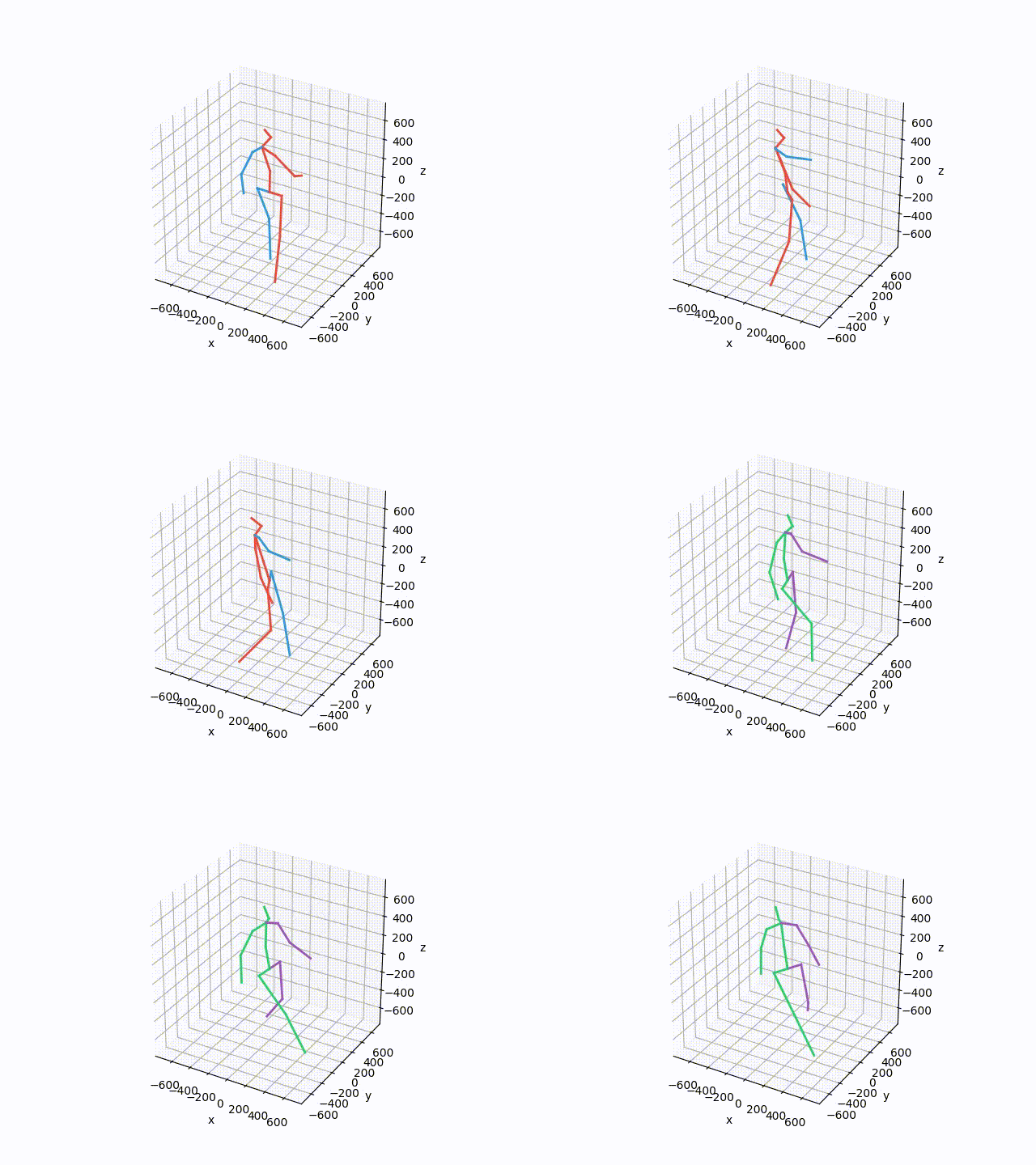
Plot and save the ground truth  and predicted results of human 3.6 M and CMU mocap dataset.
Plot and save the ground truth and predicted results of human 3.6 M and CMU mocap dataset.

Visualization-of-Human3.6M-Dataset Plot and save the ground truth and predicted results of human 3.6 M and CMU mocap dataset. human-motion-prediction

A simple python script using Numpy and Matplotlib library to plot a Mohr's Circle when given a two-dimensional state of stress.

Mohr's Circle Calculator This is a really small personal project done for Department of Civil Engineering, Delhi Technological University (formerly, D

Plot-configurations for scientific publications, purely based on matplotlib

TUEplots Plot-configurations for scientific publications, purely based on matplotlib. Usage Please have a look at the examples in the example/ directo

A tool to plot and execute Rossmos's Formula, that helps to catch serial criminals using mathematics

Rossmo Plotter A tool to plot and execute Rossmos's Formula using python, that helps to catch serial criminals using mathematics Author: Amlan Saha Ku

Advanced_Data_Visualization_Tools - The present hands-on lab mainly uses Immigration to Canada dataset and employs advanced visualization tools such as word cloud, and waffle plot to display relations between features within the dataset.
Owner
Oliwier Szymański
self-taught coder. Most of my projects are written in Python or Java. I'm trying to learn from mistakes that I made in my codes and not only
Oliwier Szymański
Getting started with Python, Dash and Plot.ly for the Data Dashboards team

data_dashboards Getting started with Python, Dash and Plot.ly for the Data Dashboards team Getting started MacOS users: # Install the pyenv version ma

Department for Levelling Up, Housing and Communities 1 Nov 8, 2021
A custom qq-plot for two sample data comparision

QQ-Plot 2 Sample Just a gist to include the custom code to draw a qq-plot in python when dealing with a "two sample problem". This means when u try to

null 1 Dec 20, 2021
These data visualizations were created for my introductory computer science course using Python

Homework 2: Matplotlib and Data Visualization Overview These data visualizations were created for my introductory computer science course using Python

Sophia Huang 12 Oct 20, 2022
These data visualizations were created as homework for my CS40 class. I hope you enjoy!

Data Visualizations These data visualizations were created as homework for my CS40 class. I hope you enjoy! Nobel Laureates by their Country of Birth

null 9 Sep 2, 2022
python partial dependence plot toolbox

PDPbox python partial dependence plot toolbox Motivation This repository is inspired by ICEbox. The goal is to visualize the impact of certain feature

Li Jiangchun 723 Jan 7, 2023
python partial dependence plot toolbox

PDPbox python partial dependence plot toolbox Motivation This repository is inspired by ICEbox. The goal is to visualize the impact of certain feature

Li Jiangchun 531 Feb 16, 2021
basemap - Plot on map projections (with coastlines and political boundaries) using matplotlib.

Basemap Plot on map projections (with coastlines and political boundaries) using matplotlib. ⚠️ Warning: this package is being deprecated in favour of

Matplotlib Developers 706 Dec 28, 2022
This is a Cross-Platform Plot Manager for Chia Plotting that is simple, easy-to-use, and reliable.

Swar's Chia Plot Manager A plot manager for Chia plotting: https://www.chia.net/ Development Version: v0.0.1 This is a cross-platform Chia Plot Manage

Swar Patel 1.3k Dec 13, 2022
Plot, scatter plots and histograms in the terminal using braille dots

Plot, scatter plots and histograms in the terminal using braille dots, with (almost) no dependancies. Plot with color or make complex figures - similar to a very small sibling to matplotlib. Or use the canvas to plot dots and lines yourself.

Tammo Ippen 207 Dec 30, 2022
Streamlit component for Let's-Plot visualization library

streamlit-letsplot This is a work-in-progress, providing a convenience function to plot charts from the Lets-Plot visualization library. Example usage

Randy Zwitch 9 Nov 3, 2022