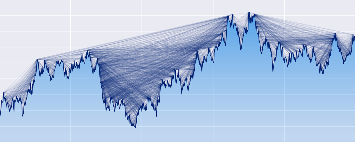
Arras.io Highest Scores Over Time Bar Chart Race
This repo contains a python script (make_racing_bar_chart.py) that can generate a csv file which can be uploaded to flourish.studio in order to generate an interactive bar chart race for the highest arras scores over time.
Instructions for using the script are located within it as a giant comment. The process is somewhat complicated and involves downloading multiple google sheets as csv files, changing numerous configuration variables, multiple runs and edits and reruns of the make_racing_bar_chart.py script, and much more, so read the instructions carefully.
The csv file generated by the script that can be uploaded to flourish.studio will be located in the generated_files directory, and is only generated if a certain config variable is set to True because writing to a csv massively increases the script's runtime
 36 Sep 28, 2022

 5 Nov 8, 2022
 9 Apr 2, 2022

 81 Dec 15, 2022

 7 Sep 9, 2022

 3 Oct 10, 2022
 26 Dec 17, 2022

 3 Jul 9, 2021
 195 Dec 22, 2022

 5 Dec 23, 2022
 3 Feb 17, 2022
 7 Oct 27, 2021
 10 Jan 6, 2023
 15 Dec 28, 2022
 1 Dec 21, 2021
 1 Jan 22, 2022
 0 May 27, 2022
 1 Jan 17, 2022
 1 Jan 7, 2022