Script to create an animated data visualisation for categorical timeseries data - GIF choropleth map with annotations.

Overview

choropleth_ldn

Simple script to create a chloropleth map of London with categorical timeseries data.

The script in main.py creates a gif of the most frequent animal types rescued by the London Fire Brigade over the years, by borough. This is what that looks like:

rescues per borough GIF

It also performs some cleaning of the dataset, i.e.:

  • removing boroughs that are not part of Greater London.
  • replacing animal entries that are "Unknown - ..." e.g. "Unknown - Heavy Livestock Animal" to just "Unknown".

As a quick note, there are better ways to create gifs that don't involve saving down individual frames. However, I wanted to be able to look at the frames on their own as well.

How to run

Install the required libraries by running pip install -r requirements.txt or conda install --file requirements.txt.

Create a folder called fig. This is where the script saves individual frames and the final gif.

Then run main.py.

Data sources

London Fire Brigade Animal Rescue Dataset: https://data.london.gov.uk/dataset/animal-rescue-incidents-attended-by-lfb (originally downloaded in 09/2021)

London Borough Map: https://data.london.gov.uk/dataset/statistical-gis-boundary-files-london

Acknowledgements

Special thanks to Ben Dexter Cooley for his excellent articles on creating chloropleth maps and GIFs in python.

(article on maps, article on gifs)

You might also like...
Python library that makes it easy for data scientists to create charts.

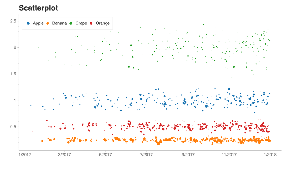
Chartify Chartify is a Python library that makes it easy for data scientists to create charts. Why use Chartify? Consistent input data format: Spend l

Using SQLite within Python to create database and analyze Starcraft 2 units data (Pandas also used)

SQLite python Starcraft 2 English This project shows the usage of SQLite with python. To create, modify and communicate with the SQLite database from

Create artistic visualisations with your exercise data (Python version)

strava_py Create artistic visualisations with your exercise data (Python version). This is a port of the R strava package to Python. Examples Facets A

:bowtie: Create a dashboard with python!

Installation | Documentation | Gitter Chat | Google Group Bowtie Introduction Bowtie is a library for writing dashboards in Python. No need to know we

Create HTML profiling reports from pandas DataFrame objects

Pandas Profiling Documentation | Slack | Stack Overflow Generates profile reports from a pandas DataFrame. The pandas df.describe() function is great

Create HTML profiling reports from pandas DataFrame objects

Pandas Profiling Documentation | Slack | Stack Overflow Generates profile reports from a pandas DataFrame. The pandas df.describe() function is great

Painlessly create beautiful matplotlib plots.

Announcement Thank you to everyone who has used prettyplotlib and made it what it is today! Unfortunately, I no longer have the bandwidth to maintain

Create a visualization for Trump's Tweeted Words Using Python

Data Trump's Tweeted Words This plot illustrates twitter word occurences. We already did the coding I needed for this plot, so I was very inspired to

Python package to Create, Read, Write, Edit, and Visualize GSFLOW models

pygsflow pyGSFLOW is a python package to Create, Read, Write, Edit, and Visualize GSFLOW models API Documentation pyGSFLOW API documentation can be fo

Owner
null
HW_02 Data visualisation task

HW_02 Data visualisation and Matplotlib practice Instructions for HW_02 Idea for data analysis As I was brainstorming ideas and running through databa

null 9 Dec 13, 2022
An interactive dashboard for visualisation, integration and classification of data using Active Learning.

AstronomicAL An interactive dashboard for visualisation, integration and classification of data using Active Learning. AstronomicAL is a human-in-the-

null 45 Nov 28, 2022
A customized interface for single cell track visualisation based on pcnaDeep and napari.

pcnaDeep-napari A customized interface for single cell track visualisation based on pcnaDeep and napari. ?? Under construction You can get test image

ChanLab 2 Nov 7, 2021
Python package for the analysis and visualisation of finite-difference fields.

discretisedfield Marijan Beg1,2, Martin Lang2, Samuel Holt3, Ryan A. Pepper4, Hans Fangohr2,5,6 1 Department of Earth Science and Engineering, Imperia

ubermag 12 Dec 14, 2022
Time series visualizer is a flexible extension that provides filling world map by country from real data.

Time-series-visualizer Time series visualizer is a flexible extension that provides filling world map by country from csv or json file. You can know d

Long Ng 3 Jul 9, 2021
A Python Library for Self Organizing Map (SOM)

SOMPY A Python Library for Self Organizing Map (SOM) As much as possible, the structure of SOM is similar to somtoolbox in Matlab. It has the followin

Vahid Moosavi 497 Dec 29, 2022
basemap - Plot on map projections (with coastlines and political boundaries) using matplotlib.

Basemap Plot on map projections (with coastlines and political boundaries) using matplotlib. ⚠️ Warning: this package is being deprecated in favour of

Matplotlib Developers 706 Dec 28, 2022
Implementation of SOMs (Self-Organizing Maps) with neighborhood-based map topologies.

py-self-organizing-maps Simple implementation of self-organizing maps (SOMs) A SOM is an unsupervised method for learning a mapping from a discrete ne

Jonas Grebe 6 Nov 22, 2022
Python library that makes it easy for data scientists to create charts.

Chartify Chartify is a Python library that makes it easy for data scientists to create charts. Why use Chartify? Consistent input data format: Spend l

Spotify 3.2k Jan 4, 2023
Python library that makes it easy for data scientists to create charts.

Chartify Chartify is a Python library that makes it easy for data scientists to create charts. Why use Chartify? Consistent input data format: Spend l

Spotify 2.8k Feb 18, 2021