Python library that makes it easy for data scientists to create charts.

Overview

Chartify

status release python CI

Chartify is a Python library that makes it easy for data scientists to create charts.

Why use Chartify?

  • Consistent input data format: Spend less time transforming data to get your charts to work. All plotting functions use a consistent tidy input data format.
  • Smart default styles: Create pretty charts with very little customization required.
  • Simple API: We've attempted to make the API as intuitive and easy to learn as possible.
  • Flexibility: Chartify is built on top of Bokeh, so if you do need more control you can always fall back on Bokeh's API.

Examples

https://raw.githubusercontent.com/spotify/chartify/master/docs/_static/chartify1.png

https://raw.githubusercontent.com/spotify/chartify/master/docs/_static/chartify2.png

https://raw.githubusercontent.com/spotify/chartify/master/docs/_static/chartify3.png

https://raw.githubusercontent.com/spotify/chartify/master/docs/_static/chartify4.png

https://raw.githubusercontent.com/spotify/chartify/master/docs/_static/chartify5.png

https://raw.githubusercontent.com/spotify/chartify/master/docs/_static/chartify6.png

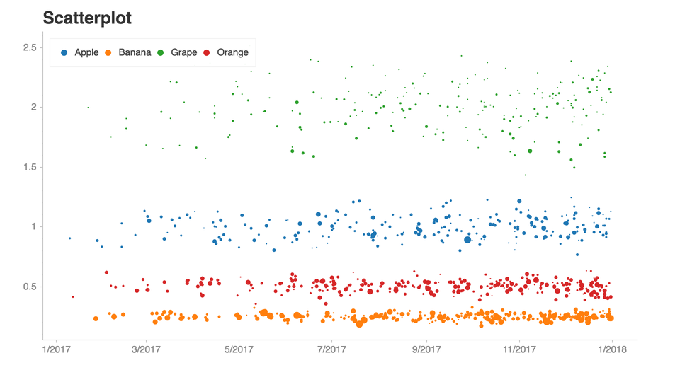
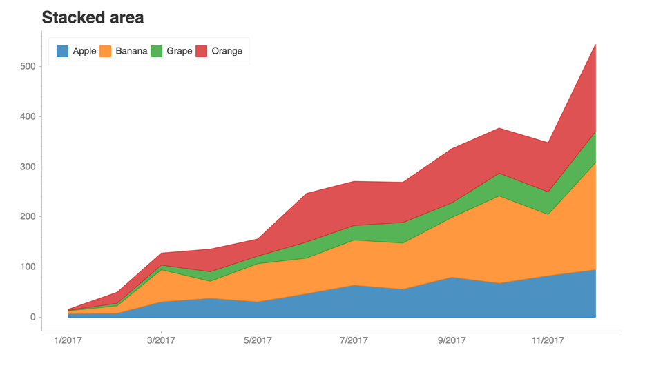
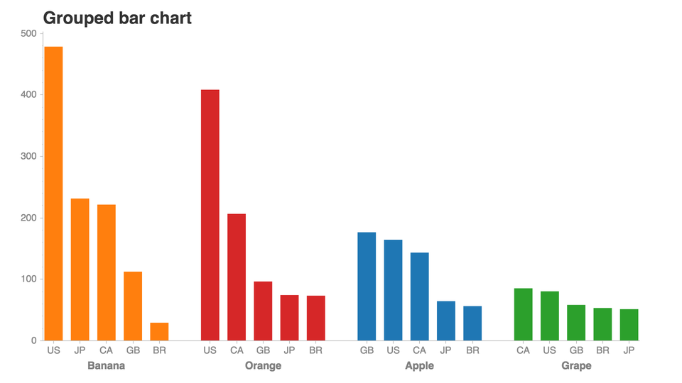
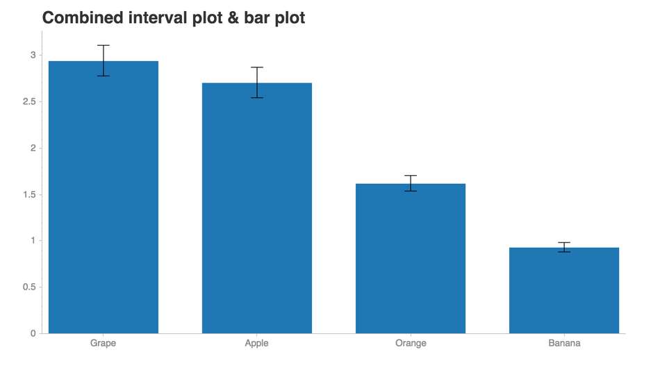
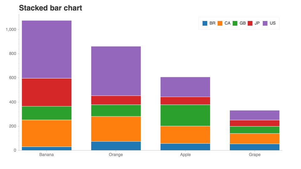
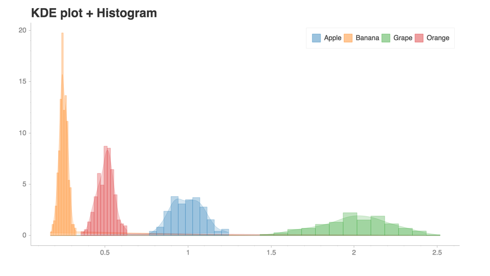
See this notebook for more examples!.

Installation

  1. Chartify can be installed via pip:

pip3 install chartify

  1. Install chromedriver requirement (Optional. Needed for PNG output):
    • Install google chrome.
    • Download the appropriate version of chromedriver for your OS here.
    • Copy the executable file to a directory within your PATH.
      • View directorys in your PATH variable: echo $PATH
      • Copy chromedriver to the appropriate directory, e.g.: cp chromedriver /usr/local/bin

Getting started

This tutorial notebook is the best place to get started with a guided tour of the core concepts of Chartify.

From there, check out the example notebook for a list of all the available plots.

Docs

Documentation available on chartify.readthedocs.io

Getting support

Join #chartify on spotify-foss.slack.com (Get an invite)

Use the chartify tag on StackOverflow.

Code of Conduct

This project adheres to the Open Code of Conduct. By participating, you are expected to honor this code.

Contributing

See the contributing docs.

Comments
  • Improve docs with interactive tutorial

    Improve docs with interactive tutorial

    What this PR does / why we need it: Hey guys! I spent some time working on an "interactive" version of the Chartify tutorial notebook. We've created RMOTR Notebooks for our students, to help them get started.

    With this version, anybody can just start working on the tutorial immediately in just a couple of seconds.

    Special notes for your reviewer: I'm also working on the Chartify examples notebook, I'll update it as soon as it's done.

    Any feedback is greatly appreciated!

    Release note:

    NONE
    
    opened by matiascaputti 7
  • Bump Pandas requirement to 1.0.0

    Bump Pandas requirement to 1.0.0

    What this PR does / why we need it:

    Pandas 1.0 has been out for a few months, and seems stable enough that we should start supporting it!

    In addition, I noticed some inconsistencies between versions used in the package requirements itself, and in the requirements specified for local development. These have now been rectified (and future-proofed) by including the package requirements.txt from the dev one instead of specifying everything twice.

    Special notes for your reviewer:

    On my local setup (Windows with WSL) there are some problems with chromedriver that I haven't been able to figure out. Because of this, saving images as png doesn't work, and thus that test has been skipped when I've tested locally. I doubt that it would make a difference for this change, but might be worth double-checking in the PR builds.

    Release note:

    Bump Pandas requirement to 1.0
    
    opened by tomasaschan 6
  • Adding orders of magnitude to fractional values in plot_bar_stacked

    Adding orders of magnitude to fractional values in plot_bar_stacked

    Is this a BUG REPORT or FEATURE REQUEST?:

    Uncomment only one, leave it on its own line:

    type: bug

    type: feature

    Environment:

    • Chartify version(s): beta (pip install)
    • Operating System(s): Linux 4.19.3-300.fc29.x86_64 x86_64
    • Python version(s): 3.7

    What happened: I'm getting an extra two orders of magnitude (or more if I set a floating point on the tick value) for values with floating points in stacked bar charts.

    What you expected to happen: When setting the y axis tick values to '0%", I should get percentage values ranging from 0-100%.

    How to reproduce it (as minimally and precisely as possible): Plot all chromosome data using stacked bar plot

    RdGy = chartify.color_palettes['RdGy'] shifted_RdGy = RdGy.shift_palette('black', percent=20) shifted_RdGy.show()

    (chartify.Chart(blank_labels=True, x_axis_type='categorical') .style.set_color_palette('diverging', palette=shifted_RdGy) .plot.bar_stacked( data_frame=results, categorical_columns='#ID', categorical_order_by='labels', categorical_order_ascending=True, numeric_column='Covered_percent', stack_column='sample', normalize=False) .set_legend_location('outside_right', orientation='vertical') .axes.set_yaxis_tick_format('0.0%') .axes.set_xaxis_tick_orientation('vertical') .show('png'))

    Anything else we need to know?: Included the df and ipynb if you want to replicate. Allen_concatData.txt pileup.zip

    opened by magruca 6
  • Outside_bottom legend breaks with Bokeh 1.2

    Outside_bottom legend breaks with Bokeh 1.2

    Bokeh 1.2.0:

    /usr/local/lib/python3.6/dist-packages/confidence/analysis/base.py in _summary_plot(self, level_name, level_df, remaining_groups, groupby)
        233 
        234             ch = self._ordinal_summary_plot(level_name, level_df,
    --> 235                                             remaining_groups, groupby)
        236         else:
        237             ch = self._categorical_summary_plot(level_name, level_df,
    /usr/local/lib/python3.6/dist-packages/confidence/analysis/base.py in _ordinal_summary_plot(self, level_name, level_df, remaining_groups, groupby)
        249         return self._ordinal_plot('point_estimate', df, groupby, level_name,
        250                                   remaining_groups, absolute=True,
    --> 251                                   title=title, y_axis_label=y_axis_label)
        252 
        253     def _ordinal_plot(self, center_name, df, groupby, level_name,
    /usr/local/lib/python3.6/dist-packages/confidence/analysis/base.py in _ordinal_plot(self, center_name, df, groupby, level_name, remaining_groups, absolute, title, y_axis_label)
        278         ch.set_title(title)
        279         if colors:
    --> 280             ch.set_legend_location('outside_bottom')
        281         return ch
        282 
    /usr/local/lib/python3.6/dist-packages/chartify/_core/chart.py in set_legend_location(self, location, orientation)
        332                 self._subtitle_glyph.text)
        333         elif location == 'outside_bottom':
    --> 334             add_outside_legend('bottom_center', 'below')
        335         elif location == 'outside_right':
        336             add_outside_legend('top_left', 'right')
    /usr/local/lib/python3.6/dist-packages/chartify/_core/chart.py in add_outside_legend(legend_location, layout_location)
        320                 return self
        321             new_legend = self.figure.legend[0]
    --> 322             new_legend.plot = None
        323             new_legend.orientation = orientation
        324             self.figure.add_layout(new_legend, layout_location)
    /usr/local/lib/python3.6/dist-packages/bokeh/core/has_props.py in __setattr__(self, name, value)
        286 
        287             raise AttributeError("unexpected attribute '%s' to %s, %s attributes are %s" %
    --> 288                 (name, self.__class__.__name__, text, nice_join(matches)))
        289 
        290     def __str__(self):
    AttributeError: unexpected attribute 'plot' to Legend, possible ```
    good first issue 
    opened by cphalpert 5
  • ValueError: Bad 'legend' parameter value: None

    ValueError: Bad 'legend' parameter value: None

    Hi, I updated to the latest version of bokeh yesterday and get now this warning: `BokehDeprecationWarning: 'legend' keyword is deprecated, use explicit 'legend_label', 'legend_field', or 'legend_group' keywords instead

    followed by: ValueError: Bad 'legend' parameter value: None

    The issue seems to be related to the following section of the plot.py code 1397 if color_column: 1398 legend = bokeh.core.properties.field('color_column') 1399 else: 1400 legend = None

    Please could you tell me how to fix this. Thank you

    opened by jpkoc 4
  • Fixes #128

    Fixes #128

    What this PR does / why we need it:

    Which issue(s) this PR fixes

    Fixes #

    Special notes for your reviewer:

    Release note:


    opened by haf 2
  • Change bokeh version requirement

    Change bokeh version requirement

    Chartify doesn't work with bokeh 2.3.0, so require <2.3.0 for now, until a fix is in place.

    /Pelle

    What this PR does / why we need it:

    Which issue(s) this PR fixes

    Fixes #

    Special notes for your reviewer:

    Release note:


    opened by iampelle 2
  • Bokeh 2.0 is imminent

    Bokeh 2.0 is imminent

    Just a heads-up that Bokeh 2.0 will be coming out in the next week or so. At a minimum you may want to release packages that versions to <2.0 if they are not already. Whenever you look to update packages for Bokeh 2.0 compat we'd be happy to help over at the Development topic on the Discourse:

    https://discourse.bokeh.org/c/development/7

    opened by bryevdv 2
  • Calling Chart.plot.line method with all 0 y_column raises OverflowError

    Calling Chart.plot.line method with all 0 y_column raises OverflowError

    type: bug

    Environment:

    • Chartify version(s): 2.3.5
    • Operating System(s): MacOS 10.14.2
    • Python version(s): 3.6.5

    What happened: Calling line method with all 0 y_column raises OverflowError

    What you expected to happen: Return an instance of chart

    How to reproduce it (as minimally and precisely as possible):

    import chartify
    import pandas as pd
    
    df = pd.DataFrame(data={'col1': [1, 2, 3], 'col2': [0, 0, 0]})
    
    ch = chartify.Chart()
    ch.plot.line(data_frame=df,
                 x_column='col1',
                 y_column='col2')
    
    bug 
    opened by fabioconcina 2
  • Annotating the graph with horizontal and vertical lines

    Annotating the graph with horizontal and vertical lines

    Is this a BUG REPORT or FEATURE REQUEST?:

    type: feature

    Maybe this is already possible with Chartify and I missed it, but it would be great if Chartify provided an easy way to overlay/add horizontal and vertical lines (of different colors, different dash patterns) to a graph! e.g. to represent levels, or dates of specific events, on the graph.

    opened by troyshu 2
  • Feature: add (my)binder links for (tutorial and examples) notebooks

    Feature: add (my)binder links for (tutorial and examples) notebooks

    Is this a BUG REPORT or FEATURE REQUEST?:

    type: feature

    Anything else we need to know?:

    A tutorial using mybinder.org (like bokeh's tutorial) makes it much more convenient to test the library before installing it.

    opened by gdementen 2
  • Added image enhancement methods and changed to the show() method.

    Added image enhancement methods and changed to the show() method.

    What this PR does / why we need it: The new changes made on this branch are related to image enhancement, the image quality of the chartify is low when we copy the png to a different platform, as I started to work on this issue. This pull request is related to #37, and #86. I found out that bokeh has the same problem and they have the same alternative as we do, i.e., resizing. But they couldn't work on the dpi(dots per inch) functionality because of the lack of human resources and the technical difficulty they have to change something this huge. I didn't try to do something which bokeh ignored, but I came up with my alternative with the help of the PIL library. I used PIL to add some features to this file. Like colour enhancement, brightness, contrast, etc. The changes could be boiled down to type and filter methods. The type is enhancement classes implementing a common interface, containing a single method. As with filter, it is a pre-defined set of filters, which can be used with the Image.filter() method. I had to add --virtual-time-budget(set the system to wait the specified number of virtual milliseconds before deeming the page to be ready.) This is related to #27.

    Which issue(s) this PR fixes #37, #86, #27.

    opened by valleyofblackpanther 0
  • SECURITY.md

    SECURITY.md

    What this PR does / why we need it: We need a security policies measurement for the chartify package. I tried to add some which resonate with the values that I have seen as a contributor to it. I tried my best to align the security measures with chartify vulnerabilities that I could identify.

    Which issue(s) this PR fixes#132

    Fixes # Security policies

    Special notes for your reviewer: I guess there should be more points that certainly need to be on the document. If anyone has any points, create a patch or comment on the pull request.

    opened by valleyofblackpanther 0
  • Reopen

    Reopen "Update options.py (#133)"

    Reopens spotify/chartify#133

    After merging this into a release branch I realised it doesn't work and isn't trivial to fix. See this repo for inspiration on how to fix it: https://github.com/fmenabe/python-yamlordereddictloader

    opened by iampelle 0
  • cumulative histogram

    cumulative histogram

    FEATURE REQUEST:

    type: feature

    It would be great if you could add the cumulative option type to the histogram plot as there is in:

    https://plotly.com/python/histograms/#cumulative-histogram

    opened by xflc 0
  • Trying to get in touch regarding a security issue

    Trying to get in touch regarding a security issue

    Hey there!

    I'd like to report a security issue but cannot find contact instructions on your repository.

    If not a hassle, might you kindly add a SECURITY.md file with an email, or another contact method? GitHub recommends this best practice to ensure security issues are responsibly disclosed, and it would serve as a simple instruction for security researchers in the future.

    Thank you for your consideration, and I look forward to hearing from you!

    (cc @huntr-helper)

    opened by zidingz 1
  • Doesn't plot with

    Doesn't plot with "html" in colab

    First: image

    Then note the empty output:

    image

    bug

    Environment:

    • Chartify version(s): latest
    • Operating System(s): macos
    • Python version(s): 3.8

    What happened: trying first example, in colab.research.google.com

    What you expected to happen: something to show

    How to reproduce it (as minimally and precisely as possible):

    Anything else we need to know?:

    opened by haf 0
Releases(3.0.5)
  • 3.0.5(Dec 13, 2022)

  • 3.0.4(Oct 18, 2022)

    This update is a maintanaince release with no new features and mainly behind the scenes updates:

    • Update github actions
    • Limit versions of bokeh, Jinja, and importlib-metadata to fix build error. This is only necessary for python 3.6 it seems.
    • Updated required versions of pytest and coverage
    • Update setup.py (#135)
    • Update options.py (#133)
    • Change ChromeDriver link to avoid deprecated site (#134)
    • Added test case and fix from PR #127
    • Eliminate a number of deprecation warnings
    • Add publish to PyPi workflow

    Co-authored-by: Anurag Kumar [email protected] Co-authored-by: Moad Akhraz [email protected] Co-authored-by: Damian [email protected] Co-authored-by: Damian [email protected]

    Source code(tar.gz)
    Source code(zip)
  • 3.0.3(Nov 2, 2020)

  • 3.0.2(Nov 2, 2020)

  • 3.0.1(Jun 2, 2020)

  • 3.0.0(May 29, 2020)

  • 2.7.0(Nov 27, 2019)

    Improvements:

    • Updated default yaml loader to move off of deprecated method (Thanks @vh920!)
    • Updated legend handling to adjust for deprecated methods in recent versions of Bokeh (Thanks for reporting @jpkoc)
    • Updated license in setup.py (Thanks for reporting @jsignell)
    • Bump base Pillow dependency to avoid insecure version.
    • Update MANIFEST to include missing files (Thanks @toddrme2178!)
    Source code(tar.gz)
    Source code(zip)
  • 2.6.1(Aug 15, 2019)

    Bugfixes:

    • Moved package requirements and fixed bug that occured with latest version of Bokeh (Thanks @emschuch & @mollymzhu!)
    • Fixed bug in README while generating docs (Thanks @Bharat123rox!)
    Source code(tar.gz)
    Source code(zip)
  • 2.6.0(Mar 8, 2019)

    Improvements:

    • Allows users to plot colors on bar charts that aren't contained in the categorical axis.

    Bugfixes:

    • Fixed bug that caused float types to break when plotted with categorical text plots (Thanks for finding @danela!)
    • Fixed broken readme links.
    Source code(tar.gz)
    Source code(zip)
  • 2.5.0(Feb 17, 2019)

  • 2.4.0(Feb 16, 2019)

    Improvements:

    • Added second Y axis plotting.
    • Removed Bokeh loading notification on import (Thanks @canavandl!)
    • Added support for custom Bokeh resource loading (Thanks @canavandl!)
    • Added example for Chart.save() method (Thanks @david30907d!)

    Bugfixes:

    • Updated documentation for saving and showing svgs.
    • Fixed bug that broke plots with no difference between min and max points. (Thanks for finding @fabioconcina!)
    Source code(tar.gz)
    Source code(zip)
  • 2.3.5(Nov 21, 2018)

    Improvements:

    • Updated docstrings (Thanks @gregorybchris @ItsPugle!)
    • Added SVG output options to Chart.show() and Chart.save() (Thanks for the suggestion @jdmendoza!)

    Bugfixes:

    • Fixed bug that caused source label to overlap with xaxis labels.
    • Fixed bug that prevented x axis orientation changes with datetime axes (Thanks for finding @simonwongwong!)
    • Fixed bug that caused subtitle to disappear with outside_top legend location (Thanks for finding @simonwongwong!)
    • Line segment callout properties will work correctly. (Thanks @gregorybchris!)
    Source code(tar.gz)
    Source code(zip)
  • 2.3.3(Oct 24, 2018)

  • 2.3.2(Oct 18, 2018)

    • Added scatter plots with a single categorical axis. image

    • Stacked bar and area order now matches default vertical legend order.

    • Added method for shifting color palettes.

    • Fixed bug with text_stacked that occurred with multiple categorical levels.

    Source code(tar.gz)
    Source code(zip)
  • 2.3.1(Sep 27, 2018)

  • 2.3.0(Sep 27, 2018)

    • Added hexbin plot type.
    • More control over grouped axis label orientation.
    • Added alpha control to scatter, line, and parallel plots.
    • Added control over marker style to scatter plot.
    • Added ability to create custom color palettes.
    • Changed default accent color.
    • Visual tweaks to lollipop plot.
    • Bar plots with a few number of series will have better widths.
    Source code(tar.gz)
    Source code(zip)
Owner
Spotify
Spotify
Python library that makes it easy for data scientists to create charts.

Chartify Chartify is a Python library that makes it easy for data scientists to create charts. Why use Chartify? Consistent input data format: Spend l

Spotify 3.2k Jan 1, 2023
`charts.css.py` brings `charts.css` to Python. Online documentation and samples is available at the link below.

charts.css.py charts.css.py provides a python API to convert your 2-dimension data lists into html snippet, which will be rendered into charts by CSS,

Ray Luo 3 Sep 23, 2021
Data-FX is an addon for Blender (2.9) that allows for the visualization of data with different charts

Data-FX Data-FX is an addon for Blender (2.9) that allows for the visualization of data with different charts Currently, there are only 2 chart option

Landon Ferguson 20 Nov 21, 2022
HiPlot makes understanding high dimensional data easy

HiPlot - High dimensional Interactive Plotting HiPlot is a lightweight interactive visualization tool to help AI researchers discover correlations and

Facebook Research 2.4k Jan 4, 2023
HiPlot makes understanding high dimensional data easy

HiPlot - High dimensional Interactive Plotting HiPlot is a lightweight interactive visualization tool to help AI researchers discover correlations and

Facebook Research 2k Feb 17, 2021
Simple plotting for Python. Python wrapper for D3xter - render charts in the browser with simple Python syntax.

PyDexter Simple plotting for Python. Python wrapper for D3xter - render charts in the browser with simple Python syntax. Setup $ pip install PyDexter

D3xter 31 Mar 6, 2021
🧇 Make Waffle Charts in Python.

PyWaffle PyWaffle is an open source, MIT-licensed Python package for plotting waffle charts. It provides a Figure constructor class Waffle, which coul

Guangyang Li 528 Jan 2, 2023
🧇 Make Waffle Charts in Python.

PyWaffle PyWaffle is an open source, MIT-licensed Python package for plotting waffle charts. It provides a Figure constructor class Waffle, which coul

Guangyang Li 397 Feb 17, 2021
Drag’n’drop Pivot Tables and Charts for Jupyter/IPython Notebook, care of PivotTable.js

pivottablejs: the Python module Drag’n’drop Pivot Tables and Charts for Jupyter/IPython Notebook, care of PivotTable.js Installation pip install pivot

Nicolas Kruchten 512 Dec 26, 2022
Drag’n’drop Pivot Tables and Charts for Jupyter/IPython Notebook, care of PivotTable.js

pivottablejs: the Python module Drag’n’drop Pivot Tables and Charts for Jupyter/IPython Notebook, care of PivotTable.js Installation pip install pivot

Nicolas Kruchten 419 Feb 11, 2021
Streamlit dashboard examples - Twitter cashtags, StockTwits, WSB, Charts, SQL Pattern Scanner

streamlit-dashboards Streamlit dashboard examples - Twitter cashtags, StockTwits, WSB, Charts, SQL Pattern Scanner Tutorial Video https://ww

null 122 Dec 21, 2022
mysql relation charts

sqlcharts 自动生成数据库关联关系图 复制settings.py.example 重命名为settings.py 将数据库配置信息填入settings.DATABASE,目前支持mysql和postgresql 执行 python build.py -b,-b是读取数据库表结构,如果只更新匹

null 6 Aug 22, 2022
Altair extension for saving charts in a variety of formats.

Altair Saver This packge provides extensions to Altair for saving charts to a variety of output types. Supported output formats are: .json/.vl.json: V

Altair 85 Dec 9, 2022
🐞 📊 Ladybug extension to generate 2D charts

ladybug-charts Ladybug extension to generate 2D charts. Installation pip install ladybug-charts QuickStart import ladybug_charts API Documentation Loc

Ladybug Tools 3 Dec 30, 2022
GitHub English Top Charts

Help you discover excellent English projects and get rid of the interference of other spoken language.

kon9chunkit 529 Jan 2, 2023
Flexitext is a Python library that makes it easier to draw text with multiple styles in Matplotlib

Flexitext is a Python library that makes it easier to draw text with multiple styles in Matplotlib

Tomás Capretto 93 Dec 28, 2022
A Python function that makes flower plots.

Flower plot A Python 3.9+ function that makes flower plots. Installation This package requires at least Python 3.9. pip install

Thomas Roder 4 Jun 12, 2022
Script to create an animated data visualisation for categorical timeseries data - GIF choropleth map with annotations.

choropleth_ldn Simple script to create a chloropleth map of London with categorical timeseries data. The script in main.py creates a gif of the most f

null 1 Oct 7, 2021
The plottify package is makes matplotlib plots more legible

plottify The plottify package is makes matplotlib plots more legible. It's a thin wrapper around matplotlib that automatically adjusts font sizes, sca

Andy Jones 97 Nov 4, 2022