Visualizations of linear algebra algorithms for people who want a deep understanding

Overview

Visualising algorithms on symmetric matrices

Examples

QR algorithm and LR algorithm

Here, we have a GIF animation of an interactive visualisation of the QR and LR algorithms for finding eigenvalues:

depiction of one iteration of QR and LR

This depicts the result of one iteration of the algorithm in the form of a GIF animation. The ellipses denote positive-definite symmetric matrices. Such a representation by ellipses is possible because of the spectral theorem. Notice how the output is a continuous function of the input. Also notice how as the input matrix is rotated, it encounters two fixed points corresponding to its diagonalisations. One of these fixed points is stable, while the other is unstable.

The link to the Python code is here. It uses Pygame and Numpy, and is very, very rough (as a minimum viable product should be). It would be better if it could run in a browser.

Motivation

Many algorithms (like the QR algorithm for finding eigenvalues) are described in ways that are hard to understand. Specifically, it's unclear why these algorithms achieve their objectives. This is especially mysterious when the algorithms are based on fixed-point iteration, like the QR algorithm. In this repository, we hope to introduce interactive visualisations of linear algebra algorithms which should enable someone to understand how a given algorithm behaves when its inputs are varied.

Details

The visualisations should be interactive wherever possible. The reason for this is that it allows someone to see how the output of an algorithm varies when its input is changed. This can enable someone to see how the input influences convergence rate.

A positive-definite symmetric matrix can be depicted as an ellipse in 2-dimensions, or an ellipsoid in 3-dimensions. Formally, this follows from the spectral theorem.

A 2x2 triangular matrix can be depicted as a 3D coordinate.

TODO

  • Move away from Python into Javascript. This should enable interactivity in the browser.
  • Visualise QR algorithm with Wilkinson shifts. Each iteration is discontinuous as opposed to continuous. The input matrix should be depicted as an ellipse. The output matrix should be depicted as an ellipse.
  • Visualise Cholesky decomposition for 2x2 matrices. The input matrix should be depicted as an ellipse. The output triangular matrix should be depicted as a point in 3-dimensional space.
  • Visualise the Lanczos algorithm for 3x3 matrices. The input matrix should be depicted as an ellipsoid. What output would be useful is to be determined.
You might also like...
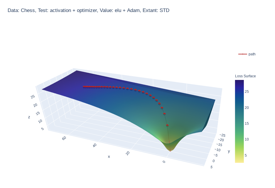
Create 3d loss surface visualizations, with optimizer path. Issues welcome!

MLVTK A loss surface visualization tool Simple feed-forward network trained on chess data, using elu activation and Adam optimizer Simple feed-forward

Make scripted visualizations in blender

Scripted visualizations in blender The goal of this project is to script 3D scientific visualizations using blender. To achieve this, we aim to bring

Standardized plots and visualizations in Python

Standardized plots and visualizations in Python pltviz is a Python package for standardized visualization. Routine and novel plotting approaches are f

Generate visualizations of GitHub user and repository statistics using GitHub Actions.

GitHub Stats Visualization Generate visualizations of GitHub user and repository statistics using GitHub Actions. This project is currently a work-in-

Visualizations of some specific solutions of different differential equations.

Diff_sims Visualizations of some specific solutions of different differential equations. Heat Equation in 1 Dimension (A very beautiful and elegant ex

Data aggregated from the reports found at the MCPS COVID Dashboard into a set of visualizations.

Montgomery County Public Schools COVID-19 Visualizer Contents About this project Data Support this project About this project Data All data we use can

Create matplotlib visualizations from the command-line

MatplotCLI Create matplotlib visualizations from the command-line MatplotCLI is a simple utility to quickly create plots from the command-line, levera

Pydrawer: The Python package for visualizing curves and linear transformations in a super simple way

pydrawer 📐 The Python package for visualizing curves and linear transformations in a super simple way. ✏️ Installation Install pydrawer package with

Curvipy - The Python package for visualizing curves and linear transformations in a super simple way

Curvipy - The Python package for visualizing curves and linear transformations in a super simple way

Owner
ogogmad
ogogmad
A collection of 100 Deep Learning images and visualizations

A collection of Deep Learning images and visualizations. The project has been developed by the AI Summer team and currently contains almost 100 images.

AI Summer 65 Sep 12, 2022
Visualizations for machine learning datasets

Introduction The facets project contains two visualizations for understanding and analyzing machine learning datasets: Facets Overview and Facets Dive

PAIR code 7.1k Jan 7, 2023
Visualizations for machine learning datasets

Introduction The facets project contains two visualizations for understanding and analyzing machine learning datasets: Facets Overview and Facets Dive

PAIR code 6.5k Feb 17, 2021
GitHub Stats Visualizations : Transparent

GitHub Stats Visualizations : Transparent Generate visualizations of GitHub user and repository statistics using GitHub Actions. ⚠️ Disclaimer The pro

YuanYap 7 Apr 5, 2022
📊📈 Serves up Pandas dataframes via the Django REST Framework for use in client-side (i.e. d3.js) visualizations and offline analysis (e.g. Excel)

???? Serves up Pandas dataframes via the Django REST Framework for use in client-side (i.e. d3.js) visualizations and offline analysis (e.g. Excel)

wq framework 1.2k Jan 1, 2023
Glue is a python project to link visualizations of scientific datasets across many files.

Glue Glue is a python project to link visualizations of scientific datasets across many files. Click on the image for a quick demo: Features Interacti

null 675 Dec 9, 2022
These data visualizations were created for my introductory computer science course using Python

Homework 2: Matplotlib and Data Visualization Overview These data visualizations were created for my introductory computer science course using Python

Sophia Huang 12 Oct 20, 2022
These data visualizations were created as homework for my CS40 class. I hope you enjoy!

Data Visualizations These data visualizations were created as homework for my CS40 class. I hope you enjoy! Nobel Laureates by their Country of Birth

null 9 Sep 2, 2022
Generate visualizations of GitHub user and repository statistics using GitHub Actions.

GitHub Stats Visualization Generate visualizations of GitHub user and repository statistics using GitHub Actions. This project is currently a work-in-

JoelImgu 3 Dec 14, 2022
A Python package for caclulations and visualizations in geological sciences.

geo_calcs A Python package for caclulations and visualizations in geological sciences. Free software: MIT license Documentation: https://geo-calcs.rea

Drew Heasman 1 Jul 12, 2022