GitHub Stats Visualizations : Transparent

Overview

GitHub Stats Visualizations : Transparent

Generate visualizations of GitHub user and repository statistics using GitHub Actions.

⚠️ Disclaimer

The project uses access token that has read access to private repositories and if there is any exception while reading data from any repository it throws Exception which is printed in the workflow logs. This exception will be viewable in the Actions tab of the repository fork, and anyone may be able to see the name of one or more private repositories.

⚙️ Installation

  1. Create a personal access token (not the default GitHub Actions token) using the instructions here. Personal access token must have permissions: read:user and repo. Copy the access token when it is generated – if you lose it, you will have to regenerate the token.

  2. Click here to create a fork of this repository

  3. If this is the README of your fork, click this link to go to the "Secrets" page. Otherwise, go to the "Settings" tab of the newly-created repository and go to the "Secrets" page (bottom left).

  4. Create a new secret with the name ACCESS_TOKEN and paste the copied personal access token as the value.

  5. By default the languages, stars, forks and repository views do not consider stats from public repositories that you have forked and contributed to. But if you want to count stats from forked repositories also you can do so by creating a new secret called COUNT_STATS_FROM_FORKS. For the value you can put any random value because the action only checks if the secret is set or not.

  6. Go to the Actions Page and press "Run Workflow" on the right side of the screen to generate images for the first time. The images will be periodically generated every hour, but they can be manually regenerated by manually running the workflow.

  7. Check out the images that have been created in the generated folder in output branch.

  8. Link back to this repository so that others can generate their own statistics images.

  9. Star this repo if you like it!


You might also like...
These data visualizations were created for my introductory computer science course using Python

Homework 2: Matplotlib and Data Visualization Overview These data visualizations were created for my introductory computer science course using Python

These data visualizations were created as homework for my CS40 class. I hope you enjoy!

Data Visualizations These data visualizations were created as homework for my CS40 class. I hope you enjoy! Nobel Laureates by their Country of Birth

A Python package for caclulations and visualizations in geological sciences.

geo_calcs A Python package for caclulations and visualizations in geological sciences. Free software: MIT license Documentation: https://geo-calcs.rea

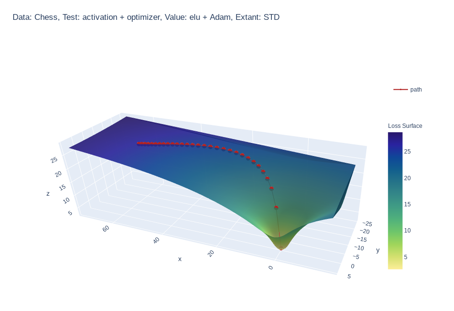
Create 3d loss surface visualizations, with optimizer path. Issues welcome!

MLVTK A loss surface visualization tool Simple feed-forward network trained on chess data, using elu activation and Adam optimizer Simple feed-forward

Make scripted visualizations in blender

Scripted visualizations in blender The goal of this project is to script 3D scientific visualizations using blender. To achieve this, we aim to bring

Standardized plots and visualizations in Python

Standardized plots and visualizations in Python pltviz is a Python package for standardized visualization. Routine and novel plotting approaches are f

Visualizations of some specific solutions of different differential equations.

Diff_sims Visualizations of some specific solutions of different differential equations. Heat Equation in 1 Dimension (A very beautiful and elegant ex

Data aggregated from the reports found at the MCPS COVID Dashboard into a set of visualizations.

Montgomery County Public Schools COVID-19 Visualizer Contents About this project Data Support this project About this project Data All data we use can

Create matplotlib visualizations from the command-line

MatplotCLI Create matplotlib visualizations from the command-line MatplotCLI is a simple utility to quickly create plots from the command-line, levera

Owner
YuanYap
YuanYap
Generate visualizations of GitHub user and repository statistics using GitHub Actions.

GitHub Stats Visualization Generate visualizations of GitHub user and repository statistics using GitHub Actions. This project is currently a work-in-

Aditya Thakekar 1 Jan 11, 2022
Create Badges with stats of Scratch User, Project and Studio. Use those badges in Github readmes, etc.

Scratch-Stats-Badge Create customized Badges with stats of Scratch User, Studio or Project. Use those badges in Github readmes, etc. Examples Document

Siddhesh Chavan 5 Aug 28, 2022
Peloton Stats to Google Sheets with Data Visualization through Seaborn and Plotly

Peloton Stats to Google Sheets with Data Visualization through Seaborn and Plotly Problem: 2 peloton users were looking for a way to track their metri

null 9 Jul 22, 2022
view cool stats related to your discord account.

DiscoStats cool statistics generated using your discord data. How? DiscoStats is not a service that breaks the Discord Terms of Service or Community G

ibrahim hisham 5 Jun 2, 2022
Visualizations for machine learning datasets

Introduction The facets project contains two visualizations for understanding and analyzing machine learning datasets: Facets Overview and Facets Dive

PAIR code 7.1k Jan 7, 2023
Visualizations for machine learning datasets

Introduction The facets project contains two visualizations for understanding and analyzing machine learning datasets: Facets Overview and Facets Dive

PAIR code 6.5k Feb 17, 2021
A collection of 100 Deep Learning images and visualizations

A collection of Deep Learning images and visualizations. The project has been developed by the AI Summer team and currently contains almost 100 images.

AI Summer 65 Sep 12, 2022
Visualizations of linear algebra algorithms for people who want a deep understanding

Visualising algorithms on symmetric matrices Examples QR algorithm and LR algorithm Here, we have a GIF animation of an interactive visualisation of t

ogogmad 3 May 5, 2022
📊📈 Serves up Pandas dataframes via the Django REST Framework for use in client-side (i.e. d3.js) visualizations and offline analysis (e.g. Excel)

???? Serves up Pandas dataframes via the Django REST Framework for use in client-side (i.e. d3.js) visualizations and offline analysis (e.g. Excel)

wq framework 1.2k Jan 1, 2023
Glue is a python project to link visualizations of scientific datasets across many files.

Glue Glue is a python project to link visualizations of scientific datasets across many files. Click on the image for a quick demo: Features Interacti

null 675 Dec 9, 2022