Visualizations of some specific solutions of different differential equations.

Overview

Diff_sims

Visualizations of some specific solutions of different differential equations.

Heat Equation in 1 Dimension

(A very beautiful and elegant explanation for the heat equation and its solution is given here

  • The heat diffusion equation gives us the temperature at every part of a conducting 1 dimensional material (specific to the current discussion), given we specify the initial condition, and the boundary conditions.
  • The thing to be noted here is that the differential equation has a doble derivative with respect to position and a single derivative with respect to time.
  • Hence, one can say that the curvature of the position function and the slope of the time function (of course, assuming one is able to write the solution as independent functions of position and time, which we can) are the key playing factors which determine how the temperature gets diffused, so to speak.
  • The co-efficient D is the thermal diffusivity constant, and here, can be thought of to be some positive constant. (Let's henceforth assume D = 1)

heat_eqn

The Gaussian

  • If the initial temperature distribution were to be in the form of a gaussian:

gauss

This function looks like a bell shaped curve centred at the origin. In other words, it tells us that at the very centre of the rod, the temperature is the highest, and as we move along in either direction it decreases very fast, and some distance from the centre, the temperature is almost zero. This ditribustion might be due to a source which is in contact with the conductor initially, exactly at the centre.

Laying off rigor (we haven't discussed about the boundary conditions here, but a gaussian converges rather rapidly as the magnitude of x increases, so essentially we can assume that the function tends to zero at its boundaries), the solution can be written in the following manner (setting certain constats to 1):

Soln

The denominator in the exponential part, actually tells us how much spread out the bell shape is, the higher it's value, more spread out it will be. The factor multiplied in the beginning is a normalizing factor, which makes sure that the energy remains constant at all times.

Hence, intuitively, we can see that as time increases, the temperature function smooths out.

  • The above solution is by no means accurate but it helps us understand the behavior.

  • One more thing to be noted, is that as the heat starts spreading, it takes more and more time for it to move farther. This is because temperature is an axponentially decaying function of time. Link to simulation here
You might also like...
Generate visualizations of GitHub user and repository statistics using GitHub Actions.

GitHub Stats Visualization Generate visualizations of GitHub user and repository statistics using GitHub Actions. This project is currently a work-in-

A Python package for caclulations and visualizations in geological sciences.

geo_calcs A Python package for caclulations and visualizations in geological sciences. Free software: MIT license Documentation: https://geo-calcs.rea

Create 3d loss surface visualizations, with optimizer path. Issues welcome!

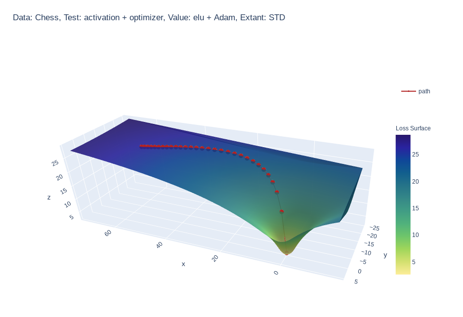
MLVTK A loss surface visualization tool Simple feed-forward network trained on chess data, using elu activation and Adam optimizer Simple feed-forward

Make scripted visualizations in blender

Scripted visualizations in blender The goal of this project is to script 3D scientific visualizations using blender. To achieve this, we aim to bring

Standardized plots and visualizations in Python

Standardized plots and visualizations in Python pltviz is a Python package for standardized visualization. Routine and novel plotting approaches are f

Generate visualizations of GitHub user and repository statistics using GitHub Actions.

GitHub Stats Visualization Generate visualizations of GitHub user and repository statistics using GitHub Actions. This project is currently a work-in-

Data aggregated from the reports found at the MCPS COVID Dashboard into a set of visualizations.

Montgomery County Public Schools COVID-19 Visualizer Contents About this project Data Support this project About this project Data All data we use can

Create matplotlib visualizations from the command-line

MatplotCLI Create matplotlib visualizations from the command-line MatplotCLI is a simple utility to quickly create plots from the command-line, levera

A small collection of tools made by me, that you can use to visualize atomic orbitals in both 2D and 3D in different aspects.

Orbitals in Python A small collection of tools made by me, that you can use to visualize atomic orbitals in both 2D and 3D in different aspects, and o

Owner
null
ScisorWiz: Differential Isoform Visualizer for Long-Read RNA Sequencing Data

ScisorWiz: Vizualizer for Differential Isoform Expression README ScisorWiz is a linux-based R-package for visualizing differential isoform expression

Alexander Stein 6 Oct 4, 2022
Visualizations for machine learning datasets

Introduction The facets project contains two visualizations for understanding and analyzing machine learning datasets: Facets Overview and Facets Dive

PAIR code 7.1k Jan 7, 2023
Visualizations for machine learning datasets

Introduction The facets project contains two visualizations for understanding and analyzing machine learning datasets: Facets Overview and Facets Dive

PAIR code 6.5k Feb 17, 2021
A collection of 100 Deep Learning images and visualizations

A collection of Deep Learning images and visualizations. The project has been developed by the AI Summer team and currently contains almost 100 images.

AI Summer 65 Sep 12, 2022
Visualizations of linear algebra algorithms for people who want a deep understanding

Visualising algorithms on symmetric matrices Examples QR algorithm and LR algorithm Here, we have a GIF animation of an interactive visualisation of t

ogogmad 3 May 5, 2022
GitHub Stats Visualizations : Transparent

GitHub Stats Visualizations : Transparent Generate visualizations of GitHub user and repository statistics using GitHub Actions. ⚠️ Disclaimer The pro

YuanYap 7 Apr 5, 2022
📊📈 Serves up Pandas dataframes via the Django REST Framework for use in client-side (i.e. d3.js) visualizations and offline analysis (e.g. Excel)

???? Serves up Pandas dataframes via the Django REST Framework for use in client-side (i.e. d3.js) visualizations and offline analysis (e.g. Excel)

wq framework 1.2k Jan 1, 2023
Glue is a python project to link visualizations of scientific datasets across many files.

Glue Glue is a python project to link visualizations of scientific datasets across many files. Click on the image for a quick demo: Features Interacti

null 675 Dec 9, 2022
These data visualizations were created for my introductory computer science course using Python

Homework 2: Matplotlib and Data Visualization Overview These data visualizations were created for my introductory computer science course using Python

Sophia Huang 12 Oct 20, 2022
These data visualizations were created as homework for my CS40 class. I hope you enjoy!

Data Visualizations These data visualizations were created as homework for my CS40 class. I hope you enjoy! Nobel Laureates by their Country of Birth

null 9 Sep 2, 2022