Data Visualizations for the #30DayChartChallenge

Overview

The #30DayChartChallenge

This repository contains all the charts made for the #30DayChartChallenge during the month of April.

This project aims to explore creativity and tools conserning #DataVisualization.

2022 Gallery

Comparison 🅰️ vs 🅱️

Day 1: part-to-whole

Tool: Adobe Illustrator

female rep at uady

Day 2: pictogram

Tool: Python + Altair
Code

Day 3: historical

Tool: Python + Matplotlib + Adobe Illustrator
Code

day 3 chart

Day 4: flora

Tool: Adobe Illustrator

day 4 chart

Day 5: slope

Tool: R
Code

Day 6: Data day ➡️ Our World In Data (OWID)

Tool: R
Code

chart day 6

Distribution 〰️

Day 7: physical

Tool: Python + Matplotlib + Seaborn
Code

chart day 7

Day 8: mountains

Tool: Python + Google Earth Engine API
Extra: To create the final layout I used Illustrator.

Code

chart day 8

Day 9: statistics

Tool: R
Code

chart day 9

Day 11: circular

Tool: R
Code

chary day 11

Day 12: The economist

Tools: R (Base plot) + Illustrator (Retouches)
Code

chart day 12

Relationships 🅰️ ↔️ 🅱️

Day 13: correlation

Tool: R
Code

chart day 13

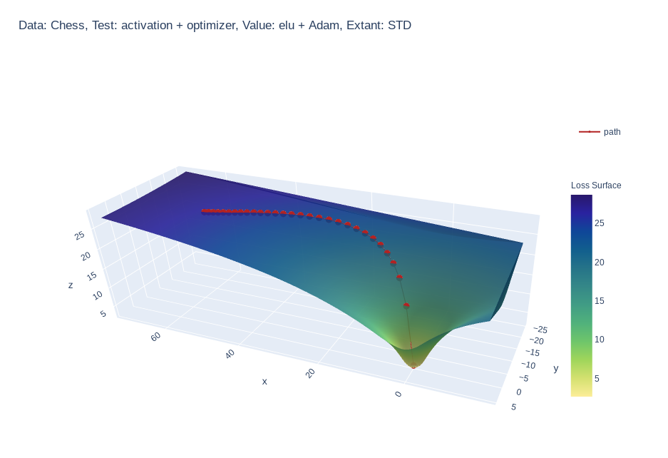
Day 14: 3-dimensional

Tool: Python + plotly
Code
chart day 14

Day 15: multivariate

Tool: R + Adobe Illustrator
Base chart

chart day 15

Day 16: environment

Tool Datawrapper Data processing and Data

Interactive chart

Day 17: connections

Tool: JavaScript + canvas-sketch
Code

Day 18: OECD

Tool: R
Code

Time series

Day 19: global change

Tool: R
Code

Day 20: new tool

Tool: Procreate

Day 21: down/upwards

Tool: Datawrapper
Interactive chart (Datawrapper)
Data processing with R

Day 22: animation

Tool: R
Code

Day 23: tiles

Tool: Flourish
Interactive charts English version and version en Español

Data processing with Python and Google Earth Engine

Day 24: Financial Times

Tool: R
Code

You might also like...
Create 3d loss surface visualizations, with optimizer path. Issues welcome!

MLVTK A loss surface visualization tool Simple feed-forward network trained on chess data, using elu activation and Adam optimizer Simple feed-forward

Make scripted visualizations in blender

Scripted visualizations in blender The goal of this project is to script 3D scientific visualizations using blender. To achieve this, we aim to bring

Standardized plots and visualizations in Python

Standardized plots and visualizations in Python pltviz is a Python package for standardized visualization. Routine and novel plotting approaches are f

Generate visualizations of GitHub user and repository statistics using GitHub Actions.

GitHub Stats Visualization Generate visualizations of GitHub user and repository statistics using GitHub Actions. This project is currently a work-in-

Visualizations of some specific solutions of different differential equations.

Diff_sims Visualizations of some specific solutions of different differential equations. Heat Equation in 1 Dimension (A very beautiful and elegant ex

Create matplotlib visualizations from the command-line

MatplotCLI Create matplotlib visualizations from the command-line MatplotCLI is a simple utility to quickly create plots from the command-line, levera

Apache Superset is a Data Visualization and Data Exploration Platform

Superset A modern, enterprise-ready business intelligence web application. Why Superset? | Supported Databases | Installation and Configuration | Rele

Apache Superset is a Data Visualization and Data Exploration Platform

Apache Superset is a Data Visualization and Data Exploration Platform

Script to create an animated data visualisation for categorical timeseries data - GIF choropleth map with annotations.

choropleth_ldn Simple script to create a chloropleth map of London with categorical timeseries data. The script in main.py creates a gif of the most f

Owner
Isaac Arroyo
Aspiring Data Visualization Designer/Specialist | I love math, asking questions and colours 🖌️ 🎨
Isaac Arroyo
Data aggregated from the reports found at the MCPS COVID Dashboard into a set of visualizations.

Montgomery County Public Schools COVID-19 Visualizer Contents About this project Data Support this project About this project Data All data we use can

James 3 Jan 19, 2022
Visualizations for machine learning datasets

Introduction The facets project contains two visualizations for understanding and analyzing machine learning datasets: Facets Overview and Facets Dive

PAIR code 7.1k Jan 7, 2023
Visualizations for machine learning datasets

Introduction The facets project contains two visualizations for understanding and analyzing machine learning datasets: Facets Overview and Facets Dive

PAIR code 6.5k Feb 17, 2021
A collection of 100 Deep Learning images and visualizations

A collection of Deep Learning images and visualizations. The project has been developed by the AI Summer team and currently contains almost 100 images.

AI Summer 65 Sep 12, 2022
Visualizations of linear algebra algorithms for people who want a deep understanding

Visualising algorithms on symmetric matrices Examples QR algorithm and LR algorithm Here, we have a GIF animation of an interactive visualisation of t

ogogmad 3 May 5, 2022
GitHub Stats Visualizations : Transparent

GitHub Stats Visualizations : Transparent Generate visualizations of GitHub user and repository statistics using GitHub Actions. ⚠️ Disclaimer The pro

YuanYap 7 Apr 5, 2022
📊📈 Serves up Pandas dataframes via the Django REST Framework for use in client-side (i.e. d3.js) visualizations and offline analysis (e.g. Excel)

???? Serves up Pandas dataframes via the Django REST Framework for use in client-side (i.e. d3.js) visualizations and offline analysis (e.g. Excel)

wq framework 1.2k Jan 1, 2023
Glue is a python project to link visualizations of scientific datasets across many files.

Glue Glue is a python project to link visualizations of scientific datasets across many files. Click on the image for a quick demo: Features Interacti

null 675 Dec 9, 2022
Generate visualizations of GitHub user and repository statistics using GitHub Actions.

GitHub Stats Visualization Generate visualizations of GitHub user and repository statistics using GitHub Actions. This project is currently a work-in-

JoelImgu 3 Dec 14, 2022
A Python package for caclulations and visualizations in geological sciences.

geo_calcs A Python package for caclulations and visualizations in geological sciences. Free software: MIT license Documentation: https://geo-calcs.rea

Drew Heasman 1 Jul 12, 2022