472 Repositories
Python satellite-visualization Libraries

A simple wrapper to analyse and visualise reinforcement learning agents' behaviour in the environment.
Visrl Visrl (pronounced "visceral") is a simple wrapper to analyse and visualise reinforcement learning agents' behaviour in the environment. Reinforc

A python visualization of the A* path finding algorithm
A python visualization of the A* path finding algorithm. It allows you to pick your start, end location and make obstacles and then view the process of finding the shortest path. You can also choose to include or exclude diagonal movement.
General Assembly's 2015 Data Science course in Washington, DC
DAT8 Course Repository Course materials for General Assembly's Data Science course in Washington, DC (8/18/15 - 10/29/15). Instructor: Kevin Markham (
Space robot - (Course Project) Using the space robot to capture the target satellite that is disabled and spinning, then stabilize and fix it up
Space robot - (Course Project) Using the space robot to capture the target satellite that is disabled and spinning, then stabilize and fix it up
MNE: Magnetoencephalography (MEG) and Electroencephalography (EEG) in Python
MNE-Python MNE-Python software is an open-source Python package for exploring, visualizing, and analyzing human neurophysiological data such as MEG, E

PyExplainer: A Local Rule-Based Model-Agnostic Technique (Explainable AI)
PyExplainer PyExplainer is a local rule-based model-agnostic technique for generating explanations (i.e., why a commit is predicted as defective) of J

PyMove is a Python library to simplify queries and visualization of trajectories and other spatial-temporal data
Use PyMove and go much further Information Package Status License Python Version Platforms Build Status PyPi version PyPi Downloads Conda version Cond

Easy genetic ancestry predictions in Python
ezancestry Easily visualize your direct-to-consumer genetics next to 2500+ samples from the 1000 genomes project. Evaluate the performance of a custom

JupyterHub extension for ContainDS Dashboards
ContainDS Dashboards for JupyterHub A Dashboard publishing solution for Data Science teams to share results with decision makers. Run a private on-pre

Streamlit Component for rendering Folium maps
streamlit-folium This Streamlit Component is a work-in-progress to determine what functionality is desirable for a Folium and Streamlit integration. C

To propose and implement a multi-class classification approach to disaster assessment from the given data set of post-earthquake satellite imagery.
To propose and implement a multi-class classification approach to disaster assessment from the given data set of post-earthquake satellite imagery.
Peloton Stats to Google Sheets with Data Visualization through Seaborn and Plotly
Peloton Stats to Google Sheets with Data Visualization through Seaborn and Plotly Problem: 2 peloton users were looking for a way to track their metri
Data-science-on-gcp - Source code accompanying book: Data Science on the Google Cloud Platform, Valliappa Lakshmanan, O'Reilly 2017
data-science-on-gcp Source code accompanying book: Data Science on the Google Cloud Platform, 2nd Edition Valliappa Lakshmanan O'Reilly, Jan 2022 Bran

Lolviz - A simple Python data-structure visualization tool for lists of lists, lists, dictionaries; primarily for use in Jupyter notebooks / presentations
lolviz By Terence Parr. See Explained.ai for more stuff. A very nice looking javascript lolviz port with improvements by Adnan M.Sagar. A simple Pytho
Kaggle-titanic - A tutorial for Kaggle's Titanic: Machine Learning from Disaster competition. Demonstrates basic data munging, analysis, and visualization techniques. Shows examples of supervised machine learning techniques.
Kaggle-titanic This is a tutorial in an IPython Notebook for the Kaggle competition, Titanic Machine Learning From Disaster. The goal of this reposito
Notebooks for computing approximations to the prime counting function using Riemann's formula.
Notebooks for computing approximations to the prime counting function using Riemann's formula.

Advanced_Data_Visualization_Tools - The present hands-on lab mainly uses Immigration to Canada dataset and employs advanced visualization tools such as word cloud, and waffle plot to display relations between features within the dataset.
Hands-on Practice Learning Lab for Data Science Overview This hands on practice lab is a part of Data Visualization with Python course offered by Cour

Optimizers-visualized - Visualization of different optimizers on local minimas and saddle points.
Optimizers Visualized Visualization of how different optimizers handle mathematical functions for optimization. Contents Installation Usage Functions

Team nan solution repository for FPT data-centric competition. Data augmentation, Albumentation, Mosaic, Visualization, KNN application
FPT_data_centric_competition - Team nan solution repository for FPT data-centric competition. Data augmentation, Albumentation, Mosaic, Visualization, KNN application
View model summaries in PyTorch!
torchinfo (formerly torch-summary) Torchinfo provides information complementary to what is provided by print(your_model) in PyTorch, similar to Tensor
Ecco is a python library for exploring and explaining Natural Language Processing models using interactive visualizations.
Visualize, analyze, and explore NLP language models. Ecco creates interactive visualizations directly in Jupyter notebooks explaining the behavior of Transformer-based language models (like GPT2, BERT, RoBERTA, T5, and T0).
Datapane is the easiest way to create data science reports from Python.
Datapane Teams | Documentation | API Docs | Changelog | Twitter | Blog Share interactive plots and data in 3 lines of Python. Datapane is a Python lib
Calculate & view the trajectory and live position of any earth-orbiting satellite
satellite-visualization A cross-platform application to calculate & view the trajectory and live position of any earth-orbiting satellite in 3D. This
Visualization of the World Religion Data dataset by Correlates of War Project.
World Religion Data Visualization Visualization of the World Religion Data dataset by Correlates of War Project. Mostly personal project to famirializ
Data-FX is an addon for Blender (2.9) that allows for the visualization of data with different charts
Data-FX Data-FX is an addon for Blender (2.9) that allows for the visualization of data with different charts Currently, there are only 2 chart option
GUI for visualization and interactive editing of SMPL-family body models ie. SMPL, SMPL-X, MANO, FLAME.
Body Model Visualizer Introduction This is a simple Open3D-based GUI for SMPL-family body models. This GUI lets you play with the shape, expression, a
GUI for visualization and interactive editing of SMPL-family body models ie. SMPL, SMPL-X, MANO, FLAME.
Body Model Visualizer Introduction This is a simple Open3D-based GUI for SMPL-family body models. This GUI lets you play with the shape, expression, a
LynxKite: a complete graph data science platform for very large graphs and other datasets.
LynxKite is a complete graph data science platform for very large graphs and other datasets. It seamlessly combines the benefits of a friendly graphical interface and a powerful Python API.
A flexible data historian based on InfluxDB, Grafana, MQTT and more. Free, open, simple.
Kotori Telemetry data acquisition and sensor networks for humans. Documentation: https://getkotori.org/ Source Code: https://github.com/daq-tools/koto
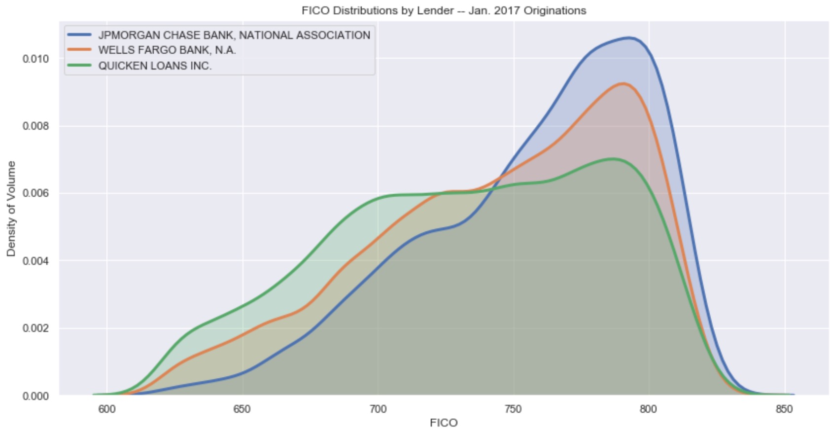
Resources for teaching & learning practical data visualization with python.
Practical Data Visualization with Python Overview All views expressed on this site are my own and do not represent the opinions of any entity with whi
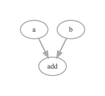
A visualization tool to show a TensorFlow's graph like TensorBoard
tfgraphviz tfgraphviz is a module to visualize a TensorFlow's data flow graph like TensorBoard using Graphviz. tfgraphviz enables to provide a visuali
Performance monitoring and testing of OpenStack
Browbeat Browbeat is a performance tuning and analysis tool for OpenStack. Browbeat is free, Open Source software. Analyze and tune your Cloud for opt

Example Code Notebooks for Data Visualization in Python
This repository contains sample code scripts for creating awesome data visualizations from scratch using different python libraries (such as matplotli
Simple web browser to visualize HiC tracks
HiCBrowser : A simple web browser to visualize Hi-C and other genomic tracks Fidel Ramirez, José Villaveces, Vivek Bhardwaj Installation You can insta
Make Your Company Data Driven. Connect to any data source, easily visualize, dashboard and share your data.
Redash is designed to enable anyone, regardless of the level of technical sophistication, to harness the power of data big and small. SQL users levera

CoANet: Connectivity Attention Network for Road Extraction From Satellite Imagery
CoANet: Connectivity Attention Network for Road Extraction From Satellite Imagery This paper (CoANet) has been published in IEEE TIP 2021. This code i

A Semantic Segmentation Network for Urban-Scale Building Footprint Extraction Using RGB Satellite Imagery
A Semantic Segmentation Network for Urban-Scale Building Footprint Extraction Using RGB Satellite Imagery This repository is the official implementati
Automatic data visualization in atom with the nteract data-explorer
Data Explorer Interactively explore your data directly in atom with hydrogen! The nteract data-explorer provides automatic data visualization, so you

Marine debris detection with commercial satellite imagery and deep learning.
Marine debris detection with commercial satellite imagery and deep learning. Floating marine debris is a global pollution problem which threatens mari
Here is some Python code that allows you to read in SVG files and approximate their paths using a Fourier series.
Here is some Python code that allows you to read in SVG files and approximate their paths using a Fourier series. The Fourier series can be animated and visualized, the function can be output as a two dimensional vector for Desmos and there is a method to output the coefficients as LaTeX code.

A distributed block-based data storage and compute engine
Nebula is an extremely-fast end-to-end interactive big data analytics solution. Nebula is designed as a high-performance columnar data storage and tabular OLAP engine.
Complete system for facial identity system. Include one-shot model, database operation, features visualization, monitoring
Complete system for facial identity system. Include one-shot model, database operation, features visualization, monitoring

Standardized plots and visualizations in Python
Standardized plots and visualizations in Python pltviz is a Python package for standardized visualization. Routine and novel plotting approaches are f

Political elections, appointment, analysis and visualization in Python
Political elections, appointment, analysis and visualization in Python poli-sci-kit is a Python package for political science appointment and election
Functions for easily making publication-quality figures with matplotlib.
Data-viz utils 📈 Functions for data visualization in matplotlib 📚 API Can be installed using pip install dvu and then imported with import dvu. You
The official repository for ROOT: analyzing, storing and visualizing big data, scientifically
About The ROOT system provides a set of OO frameworks with all the functionality needed to handle and analyze large amounts of data in a very efficien

Make scripted visualizations in blender
Scripted visualizations in blender The goal of this project is to script 3D scientific visualizations using blender. To achieve this, we aim to bring

Interactive chemical viewer for 2D structures of small molecules
👀 mols2grid mols2grid is an interactive chemical viewer for 2D structures of small molecules, based on RDKit. ➡️ Try the demo notebook on Google Cola

A Transformer-Based Feature Segmentation and Region Alignment Method For UAV-View Geo-Localization
University1652-Baseline [Paper] [Slide] [Explore Drone-view Data] [Explore Satellite-view Data] [Explore Street-view Data] [Video Sample] [中文介绍] This

A python package that extends Google Earth Engine.
A python package that extends Google Earth Engine GitHub: https://github.com/davemlz/eemont Documentation: https://eemont.readthedocs.io/ PyPI: https:
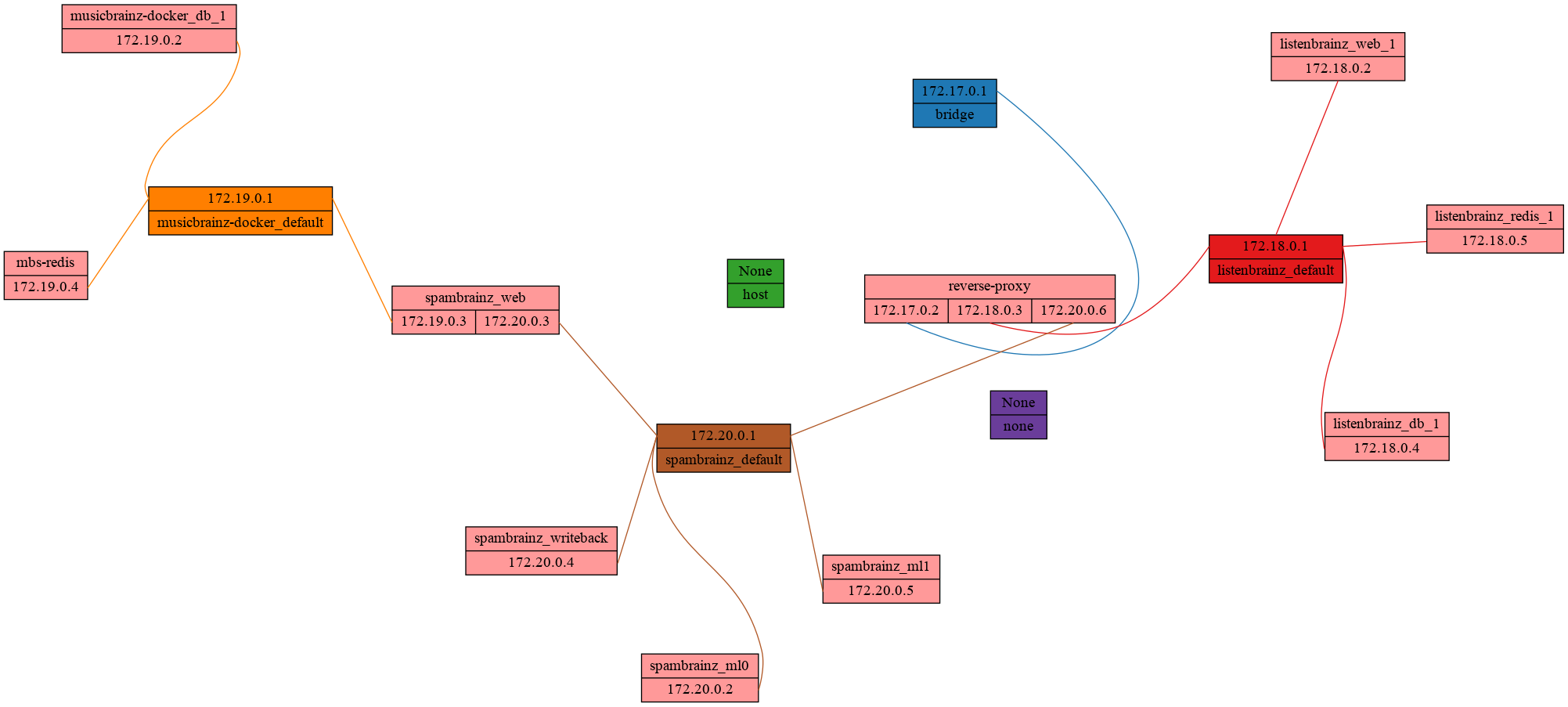
Quickly visualize docker networks with graphviz.
Docker Network Graph Visualize the relationship between Docker networks and containers as a neat graphviz graph. Example Usage usage: docker-net-graph

High performance, editable, stylable datagrids in jupyter and jupyterlab
An ipywidgets wrapper of regular-table for Jupyter. Examples Two Billion Rows Notebook Click Events Notebook Edit Events Notebook Styling Notebook Pan

🌾 PASTIS 🌾 Panoptic Agricultural Satellite TIme Series
🌾 PASTIS 🌾 Panoptic Agricultural Satellite TIme Series (optical and radar) The PASTIS Dataset Dataset presentation PASTIS is a benchmark dataset for
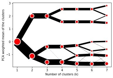
Clustergram - Visualization and diagnostics for cluster analysis in Python
Clustergram Visualization and diagnostics for cluster analysis Clustergram is a diagram proposed by Matthias Schonlau in his paper The clustergram: A

A real-time financial data streaming pipeline and visualization platform using Apache Kafka, Cassandra, and Bokeh.
Realtime Financial Market Data Visualization and Analysis Introduction This repo shows my project about real-time stock data pipeline. All the code is

yt is an open-source, permissively-licensed Python library for analyzing and visualizing volumetric data.
The yt Project yt is an open-source, permissively-licensed Python library for analyzing and visualizing volumetric data. yt supports structured, varia

Predicting Baseball Metric Clusters: Clustering Application in Python Using scikit-learn
Clustering Clustering Application in Python Using scikit-learn This repository contains the prediction of baseball metric clusters using MLB Statcast

Centroid-UNet is deep neural network model to detect centroids from satellite images.
Centroid UNet - Locating Object Centroids in Aerial/Serial Images Introduction Centroid-UNet is deep neural network model to detect centroids from Aer
gACSON software for visualization, processing and analysis of three-dimensional electron microscopy images
gACSON gACSON software is to visualize, segment, and analyze the morphology of neurons in three-dimensional electron microscopy images. If you use any

Realtime Web Apps and Dashboards for Python and R
H2O Wave Realtime Web Apps and Dashboards for Python and R New! R Language API Build and control Wave dashboards using R! New! Easily integrate AI/ML

Easily configurable, chart dashboards from any arbitrary API endpoint. JSON config only
Flask JSONDash Easily configurable, chart dashboards from any arbitrary API endpoint. JSON config only. Ready to go. This project is a flask blueprint

A part of HyRiver software stack for accessing hydrology data through web services
Package Description Status PyNHD Navigate and subset NHDPlus (MR and HR) using web services Py3DEP Access topographic data through National Map's 3DEP
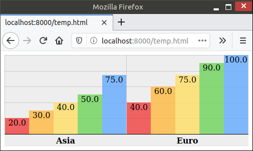
`charts.css.py` brings `charts.css` to Python. Online documentation and samples is available at the link below.
charts.css.py charts.css.py provides a python API to convert your 2-dimension data lists into html snippet, which will be rendered into charts by CSS,

A dashboard built using Plotly-Dash for interactive visualization of Dex-connected individuals across the country.
Dashboard For The DexConnect Platform of Dexterity Global Working prototype submission for internship at Dexterity Global Group. Dashboard for real ti

A python-generated website for visualizing the novel coronavirus (COVID-19) data for Greece.
COVID-19-Greece A python-generated website for visualizing the novel coronavirus (COVID-19) data for Greece. Data sources Data provided by Johns Hopki
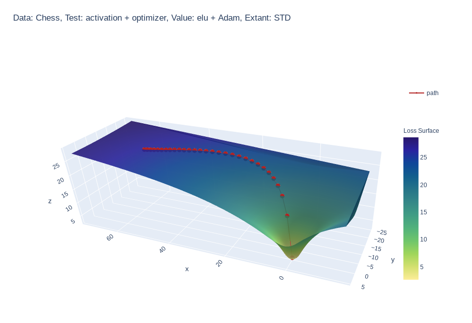
Create 3d loss surface visualizations, with optimizer path. Issues welcome!
MLVTK A loss surface visualization tool Simple feed-forward network trained on chess data, using elu activation and Adam optimizer Simple feed-forward

apysc is the Python frontend library to create html and js file, that has ActionScript 3 (as3)-like interface.
apysc apysc is the Python frontend library to create HTML and js files, that has ActionScript 3 (as3)-like interface. Notes: Currently developing and

A concise grammar of interactive graphics, built on Vega.
Vega-Lite Vega-Lite provides a higher-level grammar for visual analysis that generates complete Vega specifications. You can find more details, docume

Grammar of Scalable Linked Interactive Nucleotide Graphics
Gosling.js Gosling.js is a declarative grammar for interactive (epi)genomics visualization on the Web. ⚠️ Please be aware that the grammar of Gosling.

A declarative (epi)genomics visualization library for Python
gos is a declarative (epi)genomics visualization library for Python. It is built on top of the Gosling JSON specification, providing a simplified interface for authoring interactive genomic visualizations.

Pytorch Implementations of large number classical backbone CNNs, data enhancement, torch loss, attention, visualization and some common algorithms.
Torch-template-for-deep-learning Pytorch implementations of some **classical backbone CNNs, data enhancement, torch loss, attention, visualization and
Interactive Visualization to empower domain experts to align ML model behaviors with their knowledge.
An interactive visualization system designed to helps domain experts responsibly edit Generalized Additive Models (GAMs). For more information, check
Codes for the compilation and visualization examples to the HIF vegetation dataset
High-impedance vegetation fault dataset This repository contains the codes that compile the "Vegetation Conduction Ignition Test Report" data, which a

CNN visualization tool in TensorFlow
tf_cnnvis A blog post describing the library: https://medium.com/@falaktheoptimist/want-to-look-inside-your-cnn-we-have-just-the-right-tool-for-you-ad

Implementation of the ivis algorithm as described in the paper Structure-preserving visualisation of high dimensional single-cell datasets.
Implementation of the ivis algorithm as described in the paper Structure-preserving visualisation of high dimensional single-cell datasets.

Data Visualizer Web-Application
Viz-It Data Visualizer Web-Application If I ask you where most of the data wrangler looses their time ? It is Data Overview and EDA. Presenting "Viz-I
Fast visualization of radar_scenes based on oleschum/radar_scenes
RadarScenes Tools About This python package provides fast visualization for the RadarScenes dataset. The Open GL based visualizer is smoother than ole
A Python library for loading data from a SpaceX Starlink satellite.
Starlink Python A Python library for loading data from a SpaceX Starlink satellite. The goal is to be a simple interface for Starlink. It builds upon

Visualize large time-series data in plotly
plotly_resampler enables visualizing large sequential data by adding resampling functionality to Plotly figures. In this Plotly-Resampler demo over 11

Python toolkit for defining+simulating+visualizing+analyzing attractors, dynamical systems, iterated function systems, roulette curves, and more
Attractors A small module that provides functions and classes for very efficient simulation and rendering of iterated function systems; dynamical syst
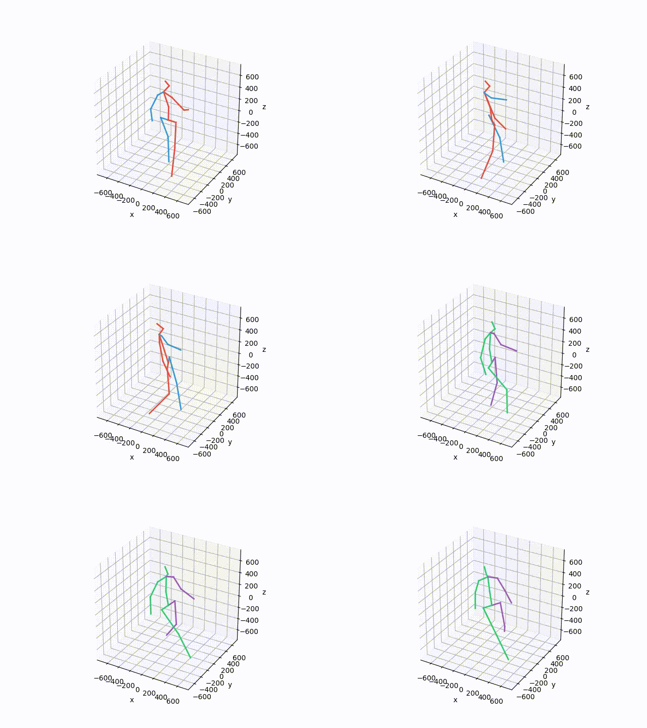
Plot and save the ground truth and predicted results of human 3.6 M and CMU mocap dataset.
Visualization-of-Human3.6M-Dataset Plot and save the ground truth and predicted results of human 3.6 M and CMU mocap dataset. human-motion-prediction

🛰️ Scripts démontrant l'utilisation de l'imagerie RADARSAT-1 à partir d'un seau AWS | 🛰️ Scripts demonstrating the use of RADARSAT-1 imagery from an AWS bucket
🛰️ Scripts démontrant l'utilisation de l'imagerie RADARSAT-1 à partir d'un seau AWS | 🛰️ Scripts demonstrating the use of RADARSAT-1 imagery from an AWS bucket

Detecting and Tracking Small and Dense Moving Objects in Satellite Videos: A Benchmark
This dataset is a large-scale dataset for moving object detection and tracking in satellite videos, which consists of 40 satellite videos captured by Jilin-1 satellite platforms.

🌐 Local tile server for viewing geospatial raster files with ipyleaflet or folium
🌐 Local Tile Server for Geospatial Rasters Need to visualize a rather large (gigabytes) raster you have locally? This is for you. A Flask application

🗂️ 🔍 Geospatial Data Management and Search API - Django Apps
Geospatial Data API in Django Resonant GeoData (RGD) is a series of Django applications well suited for cataloging and searching annotated geospatial
Learning Convolutional Neural Networks with Interactive Visualization.
CNN Explainer An interactive visualization system designed to help non-experts learn about Convolutional Neural Networks (CNNs) For more information,

Automatically visualize your pandas dataframe via a single print! 📊 💡
A Python API for Intelligent Visual Discovery Lux is a Python library that facilitate fast and easy data exploration by automating the visualization a

Delve is a Python package for analyzing the inference dynamics of your PyTorch model.
Delve is a Python package for analyzing the inference dynamics of your PyTorch model.
Python+Numpy+OpenGL: fast, scalable and beautiful scientific visualization
Python+Numpy+OpenGL: fast, scalable and beautiful scientific visualization

Tensorboard for pytorch (and chainer, mxnet, numpy, ...)
tensorboardX Write TensorBoard events with simple function call. The current release (v2.3) is tested on anaconda3, with PyTorch 1.8.1 / torchvision 0
Fast Fourier Transform-accelerated Interpolation-based t-SNE (FIt-SNE)
FFT-accelerated Interpolation-based t-SNE (FIt-SNE) Introduction t-Stochastic Neighborhood Embedding (t-SNE) is a highly successful method for dimensi
An interactive UMAP visualization of the MNIST data set.
Code for an interactive UMAP visualization of the MNIST data set. Demo at https://grantcuster.github.io/umap-explorer/. You can read more about the de
Live training loss plot in Jupyter Notebook for Keras, PyTorch and others
livelossplot Don't train deep learning models blindfolded! Be impatient and look at each epoch of your training! (RECENT CHANGES, EXAMPLES IN COLAB, A

3D rendered visualization of the austrian monuments registry
Visualization of the Austrian Monuments Visualization of the monument landscape of the austrian monuments registry (Bundesdenkmalamt Denkmalverzeichni
Create beautiful diagrams just by typing mathematical notation in plain text.
Penrose Penrose is an early-stage system that is still in development. Our system is not ready for contributions or public use yet, but hopefully will
A Bokeh project developed for learning and teaching Bokeh interactive plotting!
Bokeh-Python-Visualization A Bokeh project developed for learning and teaching Bokeh interactive plotting! See my medium blog posts about making bokeh
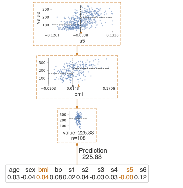
A python library for decision tree visualization and model interpretation.
dtreeviz : Decision Tree Visualization Description A python library for decision tree visualization and model interpretation. Currently supports sciki
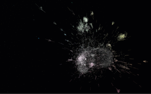
Package managers visualization
Software Galaxies This repository combines visualizations of major software package managers. All visualizations are available here: http://anvaka.git

Fast scatter density plots for Matplotlib
About Plotting millions of points can be slow. Real slow... 😴 So why not use density maps? ⚡ The mpl-scatter-density mini-package provides functional

Streamlit — The fastest way to build data apps in Python
Welcome to Streamlit 👋 The fastest way to build and share data apps. Streamlit lets you turn data scripts into sharable web apps in minutes, not week